Three Levels of Design Visceral, Behavioral, and Reflective
I remember deciding to buy Apollinaris, a German mineral water, simply because I thought it would look so good on my shelves. As it turned out, it was a very good water. But I think I would have bought it even though it was not all that great.
The nice interplay between the bottle's green and the label's beige and red as well as the font used for the brand turned this product of mass consumption into a decoration accessory for your kitchen.
-Hugues Belanger email, 2002
IT WAS L U N C H T I M E . My friends and I were in downtown Chicago, and we decided to try Cafe des Architectes in the Sofitel Hotel. As we entered the bar area, a beautiful display greeted us: water bottles, the sort you can buy in a food market, set out as works of art.
The entire rear wall of the bar was like an art gallery: frosted glass, subtly lit from behind, from floor to ceiling; shelves in front of the glass, each shelf dedicated to a different type of water. Blue, green, amber-all the wonderful hues, the glass gracefully illuminating them from behind, shaping the play of color. Water bottles as art.I resolved to find out more about this phenomenon. How did the packaging of water become an art form?
"Walk down a grocery aisle in any town in the U.S.,Canada, Europe, or Asia and there is a virtual tidal wave of bottled water brands," is how one web site that I consulted put it. Another web site emphasized the role of emotion: "Package designers and brand managers are looking beyond graphic elements or even the design as a whole to forge an emotional link between consumers and brands." The selling of premium bottled water in major cities of the world, where the tap water is perfectly healthful, has become a big business. Water sold in this way is more expensive than gasoline. Indeed, the cost is part of the attraction where the reflective side of the mind says, "If it is this expensive, it must be special."
And some of the bottles are special, sensuous, and colorful. People keep the empty bottles, sometimes refilling them with tap water, which, of course, demonstrates that the entire success of the product lies in its package, not its contents. Thus, like wine bottles, water bottles serve as decorative additions to rooms long after they have fulfilled their primary purpose. Witness another web site: "almost everyone who enjoys TyNant Natural Mineral Water admits to keeping one or two around the home or office as an ornament, vase or the like. Photographers positively delight in the bottles' photogenic appeal." (In figure 3.1, the bottle with the flower in it is TyNant.)
How does one brand of water distinguish itself from another? Packaging is one answer, distinctive packaging that, in the case of water, means bottle design. Glass, plastic, whatever the material, the design becomes the product. This is bottling that appeals to the powerful visceral level of emotion, that causes an immediate visceral reac-
tion: "Wow, yes, I like it, I want it." It is, as one designer explained to me, the "wow" factor.
The reflective side of emotion is involved as well, for the saved bottles can serve as reminders of the occasion when the beverage was ordered or consumed. Because both wine and expensive water are sometimes purchased for special occasions, the bottles serve as mementos of those occasions, taking on a special emotional value, becoming meaningful objects, not because of the objects themselves, but because of the memories they produce, and, as I noted in chapter 2, memories can trigger the powerful, long-lasting emotions.
What are the design factors in play here, where pure appearance is the issue, beauty that is all on the surface? This is where those genetic, hard-wired biological processes play their role. Here the designs are apt to be "eye candy," as sweet to the eye as the taste of candy to the mouth. Yet just as sweet-tasting candy is empty of nutritional value, so, too, is appearance empty beneath the surface.
Human responses to the everyday things of the world are complex, determined by a wide variety of factors. Some of these are outside the person, controlled by designer and manufacturer, or by advertising and such things as brand image. And some come from within, from your own, private experiences. Each of the three levels of designvisceral, behavioral, and reflective-plays its part in shaping your experience. Each is as important as the others, but each requires a different approach by the designer.
Visceral Design
Visceral design is what nature does. We humans evolved to coexist in the environment of other humans, animals, plants, landscapes, weather, and other natural phenomena. As a result, we are exquisitely tuned to receive powerful emotional signals from the environment that get interpreted automatically at the visceral level. This is where the lists of features in chapter 1 came from. Thus, the colorful plumage on male
birds was selectively enhanced through the evolutionary process to be maximally attractive to female birds-as, in turn, were the preferences of female birds so as to discriminate better among male plumages. It's an iterative, co-adaptive process, each animal adapting over many generations to serve the other. A similar process occurs between males and females of other species, between co-adaptive life forms across species, and even between animals and plants.
Fruits and flowers provide an excellent example of the co-evolution of plants and animals. Nature's evolutionary process made flowers to be attractive to birds and bees, the better to spread their pollen, and fruits to be attractive to primates and other animals, the better to spread their seeds. Fruits and flowers tend to be symmetrical, rounded, smooth, pleasant to the touch, and colorful. Flowers have pleasant odors, and most fruits taste sweet, the better to attract animals and people who will eat them and then spread the seeds, whether by spitting or defecation. In this co-evolution of design, the plants change so as to attract animals, while the animals change so as to become attracted to the plants and fruits. The human love of sweet tastes and smells and of bright, highly saturated colors probably derives from this coevolution of mutual dependence between people and plants.
The human preference for faces and bodies that are symmetrical presumably reflects selection of the fittest; non-symmetrical bodies probably are the result of some deficiency in the genes or the maturation process. Humans select for size, color, and appearance, and what you are biologically disposed to think of as attractive derives from these considerations. Sure, culture plays a role, so that, for example, some cultures prefer fat people, others thin; but even within thosecultures, there is agreement on what is and is not attractive, even if too thin or too fat for specific likes.
When we perceive something as "pretty," that judgment comes directly from the visceral level. In the world of design, "pretty" is generally frowned upon, denounced as petty, trite, or lacking depth and substance-but that is the designer's reflective level speaking (clearly trying to overcome an immediate visceral attraction). Because
designers want their colleagues to recognize them as imaginative, creative, and deep, making something "pretty" or "cute" or "fun" is not well accepted. But there is a place in our lives for such things, even if they are simple.
You can find visceral design in advertising, folk art and crafts, and children's items. Thus, children's toys, clothes, and furniture will often reflect visceral principles: bright, highly saturated primary colors. Is this great art? No, but it is enjoyable.
Adult humans like to explore experiences far beyond the basic, biologically wired-in preferences. Thus, although bitter tastes are viscerally disliked (presumably because many poisons are bitter), adults have learned to eat and drink numerous bitter things, even to prefer them. This is an "acquired taste," so called because people have had to learn to overcome their natural inclination to dislike them. So, too, with crowded, busy spaces, or noisy ones, and discordant, nonharmonic music, sometimes with irregular beats: all things that are viscerally negative but that can be reflectively positive.
The principles underlying visceral design are wired in, consistent across people and cultures. If you design according to these rules, your design will always be attractive, even if somewhat simple. If you design for the sophisticated, for the reflective level, your design can readily become dated because this level is sensitive to cultural differences, trends in fashion, and continual fluctuation. Today's sophistication runs the risk of becoming tomorrow's discard. Great designs, like great art and literature, can break the rules and survive forever, but only a few are gifted enough to be great.
At the visceral level, physical features-look, feel, and sounddominate. Thus, a master chef concentrates on presentation, arranging food artfully on the plate. Here good graphics, cleanliness, and beauty play a role. Make the car door feel firm and produce a pleasant chunking sound as it closes. Make the exhaust sound of the Harley Davidson motorcycle have a unique, powerful rumble. Make the body sleek, sexy, inviting, such as the classic 1961 Jaguar roadster of figure 3.2. Yes, we love sensuous curves, sleek surfaces, and solid, sturdy objects.
FIGURE 3.2
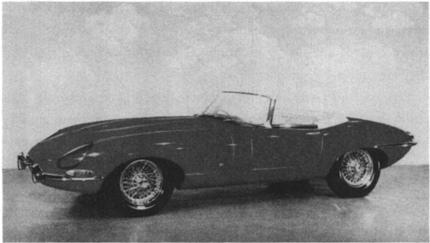
The 1961 Jaguar E-type: Viscerally exciting.
This automobile is a classic example of the power of visceral design: sleek, elegant, exciting. It is no surprise that the car is in the design collection of the New York Museum of Modern Art.
(Courtesy of the Ford Motor Corporation.)
Because visceral design is about initial reactions, it can be studied quite simply by putting people in front of a design and waiting for reactions. In the best of circumstances, the visceral reaction to appearance works so well that people take one look and say "I want it." Then they might ask, "What does it do?" And last, "And how much does it cost?" This is the reaction the visceral designer strives for, and it can work. Much of traditional market research involves this aspect of design.
Apple Computer found that when it introduced the colorful iMac computer, sales boomed, even though those fancy cabinets contained the very same hardware and software as Apple's other models, ones that were not selling particularly well. Automobile designers count on visual design to rescue a company. When Volkswagen reintroduced their classic "beetle" design in 1993, Audi developed the TT, and Chrysler brought out the PT Cruiser, sales for all three companies climbed. It's all in the appearance.
FIGURE 3.3 The sensual component of behavioral design. Behavioral design emphasizes the use of objects, in this case, the sensual feel of the shower: a key, often overlooked component of good behavioral design. The Kohler WaterHaven Shower.
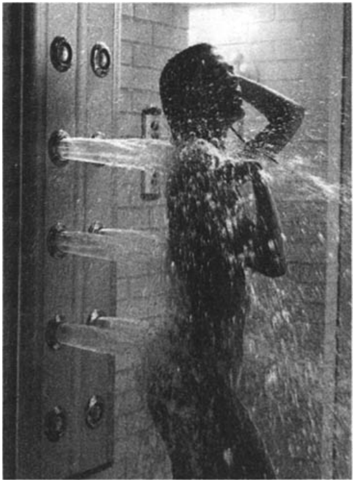
(Courtesy of the Kohler Co.)
Effective visceral design requires the skills of the visual and graphic artist and the industrial engineer. Shape and form matter. The physical feel and texture of the materials matter. Heft matters. Visceral design is all about immediate emotional impact. It has to feel good, look good. Sensuality and sexuality play roles. This is a major role of "point of presence" displays in stores, in brochures, in advertisements, and in other enticements that emphasize appearance. These may be a store's only chance of getting the customer, for many a product is purchased on looks alone. Similarly, otherwise highly rated products may be turned down if they do not appeal to the aesthetic sense of the potential buyer.
Behavioral Design
Behavioral design is all about use. Appearance doesn't really matter. Rationale doesn't matter. Performance does. This is the aspect of design that practitioners in the usability community focus upon. The
principles of good behavioral design are well known and often told; indeed, I laid them out in my earlier book, The Design of Everyday Things. What matters here are four components of good behavioral design: function, understandability, usability, and physical feel. Sometimes the feel can be the major rationale behind the product. Consider the shower shown in figure 3.3. Imagine the sensual pleasure, the feel-quite literally-of the water streaming across the body.
IN MOST behavioral design, function comes first and foremost; what does a product do, what function does it perform? If the item doesn't do anything of interest, then who cares how well it works? Even if its only function is to look good, it had better succeed. Some well-designed items miss the target when it comes to fulfilling their purpose and thus deserve to fail. If a potato peeler doesn't actually peel potatoes, or a watch doesn't tell accurate time, then nothing else matters. So the very first behavioral test a product must pass is whether it fulfills needs.
On the face of it, getting the function right would seem like the easiest of the criteria to meet, but in fact, it is tricky. People's needs are not as obvious as might be thought. When a product category already exists, it is possible to watch people using the existing products to learn what improvements can be made. But what if the category does not even exist? How do you discover a need that nobody yet knows about? This is where the product breakthroughs come from.
Even with existing products, it is amazing how seldom the designers watch their customers. I visited a major software developer to meet with the design team for one of their more widely used products, one that has an overabundance of features, but nonetheless still fails to meet my everyday needs. I came prepared with a long list of problems that I had encountered while attempting to do routine activities. Moreover, I had checked with other dissatisfied users of this product. To my great surprise, much of what I told the design team seemed to be novel. "Very interesting," they kept saying, while taking copious
notes. I was pleased that they paid attention to me, but disturbed by the fact that these rather basic points appeared to be new. Had they never watched people use their products? These designers-like many design teams in all industries-tend to keep to their desks, thinking up new ideas, testing them out on one another. As a result, they kept adding new features, but they had never studied just what patterns of activities their customers performed, just what tasks needed to be supported. Tasks and activities are not well supported by isolated features. They require attention to the sequence of actions, to the eventual goal-that is, to the true needs. The first step in good behavioral design is to understand just how people will use a product. This team had not done even this most elementary set of observations.
There are two kinds of product development: enhancement and innovation. Enhancement means to take some existing product or service and make it better. Innovation provides a completely new way of doing something, or a completely new thing to do, something that was not possible before. Of the two, enhancements are much easier.
Innovations are particularly difficult to assess. Before they were introduced, who would have thought we needed typewriters, personal computers, copying machines, or cell phones? Answer: Nobody. Today it is hard to imagine life without these items, but before they existed almost no one but an inventor could imagine what purpose they would serve, and quite often the inventors were wrong. Thomas Edison thought that the phonograph would eliminate the need for letters written on paper: business people would dictate their thoughts and mail the recordings. The personal computer was so misunderstood that several then-major computer manufacturers completely dismissed them: some of those once-large companies no longer exist. The telephone was thought to be an instrument for business, and in the early days, telephone companies tried to dissuade customers from using the phone for mere conversation and gossip.
One cannot evaluate an innovation by asking potential customers for their views. This requires people to imagine something they have no experience with. Their answers, historically, have been notoriously
bad. People have said they would really like some products that then failed in the marketplace. Similarly, they have said they were simply not interested in products that went on to become huge market successes. The cellular telephone is a good example. It was originally thought to be of value to a limited number of business people. Very few people could imagine carrying one simply for personal interaction. Indeed, when individuals first purchased cell phones, they often explained that they didn't intend to use them, but that they were "in case I have an emergency." Predicting the popularity of a new product is almost impossible before the fact, even though it may seem obvious afterward.
Enhancements to a product come primarily by watching howpeople use what exists today, discovering difficulties, and then overcoming them. Even here, however, it can be more difficult to determine the real needs than might seem obvious. People find it difficult to articulate their real problems. Even if they are aware of a problem, they don't often think of it as a design issue. Ever struggle with a key, to discover that you are inserting it upside down? Or ever lock your keys inside the automobile? Or lock the car, only to realize that you left the windows open, so you have to unlock the car and lean inside to close them? In any of these cases, would you think these were design flaws? Probably not, probably you just blamed yourself. Well, they all could be corrected by appropriate designs. Why not design a symmetrical key that works no matter which way it is inserted into a lock? Why not design cars so that the key is required to lock the doors, making it much less likely that the car can be locked with the key inside? Why not make it possible to close the windows from outside the car? All of these designs now exist, but it took clever observations for the designers to recognize that the problems could be overcome.
Ever put batteries into a product in the wrong orientation? Why is this even possible? Why shouldn't batteries be designed so that they can only go into their slots in one orientation, making it impossible to insert them improperly? I suspect battery makers don't care, and that manufacturers who purchase and specify batteries for their equipment
never considered that it was possible to do things better. Standard cylindrical batteries are excellent examples of poor behavioral design, of a failure to understand the problems facing people who must figure out just which orientation is required for each device-moreover in the face of warning labels that point out that the equipment might be damaged if the batteries are inserted incorrectly.
Consider the automobile. Sure, it is easy to note that storage areas ought to be bigger or seat adjustments easier, but how about such an obvious item as cup holders for beverages? People like to drink coffee and sodas while riding in their vehicles. Today this seems like an obvious necessity in an automobile, but it was not always thought so. Automobiles have been around roughly a century, but cup holders were not considered appropriate for their interiors until quite recently, and the innovation didn't come from the automobile manufacturersthey resisted them. What happened was that small manufacturers realized the need, probably because they had built cup holders for themselves, and then discovered that other people wanted them also. Soon, all sorts of add-on devices were being manufactured. These were relatively inexpensive and easy to install in a car: stick-on holders, magnetic holders, bean-bag holders. Some attached to the windows, some to the dashboards, and some to the space between the seats. It was only because these were so popular that manufacturers slowly started to add them as standard items inside the car. Now there is a vast array of clever cup holders. Some people claim that they purchased a particular automobile solely because of its cup holders. Buy a car solely because of the cup holders? Why not? If the car is used primarily for daily commuting and short errands around a city, convenience and comfort for drivers and passengers are the most important needs.
Even after the need for cup holders seemed obvious, German automobile manufacturers resisted them, explaining that automobiles were for driving, not drinking. (I suspect that this attitude reflects the oldfashioned German automobile design culture, which proclaims that the engineer knows best, and considers studies of real people driving their
vehicles irrelevant. But if the automobile is only for driving, why do Germans provide ashtrays, cigarette lighters, and radios?) The Germans reconsidered only when decreases in sales in the United States were attributed to the lack of cup holders. Engineers and designers who believe they do not need to watch the people who use their products are a major source of the many poor designs that confront us.
My friends at the industrial design firm of Herbst LaZar Bell told me that they had been asked by a company to redesign their floorcleaning machine to satisfy a long list of requirements. Cup holders were not on the list, but perhaps they should have been. When the designers visited maintenance workers in the middle of the night to observe just how they cleaned the floors of large commercial buildings, they discovered that workers had difficulty drinking coffee while manipulating the huge cleaning and waxing machines. As a result, the designers added cup holders. The new design had numerous major enhancements to the product in both appearance and behavior-visceral and behavioral design-and has proven to be a market success. How important was the cup holder to the success of the new design? Probably not much, except that it is symptomatic of the attention to true customer needs that signifies quality products. As Herbst LaZar Bell properly emphasizes, the real challenge to product design is "understanding end-user unmet and unarticulated needs." That's the design challenge-to discover real needs that even the people who need them cannot yet articulate.
How does one discover "unarticulated needs"? Certainly not by asking, not by focus groups, not by surveys or questionnaires. Who would have thought to mention the need for cup holders in a car, or on a stepladder, or on a cleaning machine? After all, coffee drinking doesn't seem to be a requirement for cleaning any more than for driving in an automobile. It is only after such enhancements are made that everyone believes them to be obvious and necessary. Because most people are unaware of their true needs, discovering them requires careful observations in their natural environment. The trained observ-
er can often spot difficulties and solutions that even the person experiencing them does not consciously recognize. But once an issue has been pointed out, it is easy to tell when you have hit the target. The response of the people who actually use the product is apt to be something like, "Oh, yeah, you're right, that's a real pain. Can you solve that? That would be wonderful."
After function comes understanding. If you can't understand a product, you can't use it-at least not very well. Oh, sure, you could memorize the basic operating steps, but you probably will have to be reminded over and over again what they are. With a good understanding, once an operation is explained, you are apt to say, "Oh, yes, I see," and from then on require no further explanation or reminding. "Learn once, remember forever," ought to be the design mantra.
Without understanding, people have no idea what to do when things go wrong-and things always go wrong. The secret to good understanding is to establish a proper conceptual model. In The Design of Everyday Things, I pointed out that there are three different mental images of any object. First is the image in the head of the designer-call that the "designer's model." Then the image that the person using the device has of it and the way it works: call this the "user's model." In an ideal world, the designer's model and the user's model should be identical and, as a result, the user understands and uses the item properly. Alas, designers don't talk to the final users; they only specify the product. People form their models entirely from their observations of the product-from its appearance, how it operates, what feedback it provides, and perhaps, any accompanying written material, such as the advertising and manuals. (But most people don't read the manuals.) I called the image conveyed by the product and written material the "system image."
As Figure 3.4 indicates, designers can communicate with the eventual users only through the system image of a product. Thus, a good designer will make sure that the system image of the final design conveys the proper user model. The only way to find this out is through testing: develop early prototypes, then watch as people try to use
Conceptual Models
FIGURE 3.4
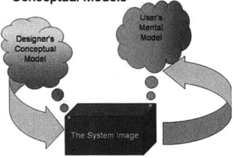
The designer's model, the system image, and the user's model. For someone to use a product successfully, they must have the same mental model (the user's model) as that of the designer (the designer's model). But the designer only talks to the user via the product itself, so the entire communication must take place through the "system image": the information conveyed by the physical product itself.
them. What is something with a good system image? Almost any design that makes apparent its operation. The rulers and margin setting in the word processor I use as I type this is one excellent example. The seat adjustment control shown in Figure 3.5 is another. Notice how the arrangement of the controls automatically refers to the operation each performs. Lift on the bottom seat control and the seat rises. Push forward on the vertical control and the seat back leans forward. That's good conceptual design.
An important component of understanding comes from feedback: a device has to give continual feedback so that a user knows that it is working, that any commands, button presses, or other requests have actually been received. This feedback can be as simple as the feel of the brake pedal when you depress it and the resultant slowing of the automobile, or a brief flash of light or sound when you push something. It is amazing, though, how many products still give inadequate
FIGURE 3.5
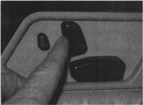
Seat controls-an excellent system image.
These seat controls explain themselves: the conceptual model is provided by the positioning of the controls to look just like the item being controlled. Want to change the seat adjustment? Push or pull, lift or depress the corresponding control and the corresponding part of the seat moves accordingly. (Mercedes Benz seat controls; photograph by the author.)
feedback. Most computer systems now display a clock face or an hourglass to indicate that they are responding, if slowly. If the delay is short, this indicator suffices, but it is completely inadequate if the delay lengthens. To be effective, feedback must enhance the conceptual model, indicating precisely what is happening and what yet remains to be done. Negative emotions kick in when there is a lack of understanding, when people feel frustrated and out of control-first uneasiness, then irritation, and, if the lack of control and understanding persists, even anger.
Usability is a complex topic. A product that does what is required, and is understandable, may still not be usable. Thus, guitars and violins do their assigned tasks well (that is, create music), they are quite simple to understand, but they are very difficult to use. The same is true of the piano, a deceptively simple-looking instrument. Musical instruments take years of dedicated practice to be used properly, and
even then, errors and poor performance are common among nonprofessionals. The relative unusability of musical instruments is accepted, in part because we know of no other alternative, in part because the results are so worthwhile.
But most of the things you use in everyday life should not require years of dedicated practice. New items appear every week, but who has the time or energy to spend the time required to learn each one? Bad design is a frequent cause of error, often unfairly blamed on users rather than on designers. Errors can lead to accidents that not only are financially expensive but can cause injury or death. There is no excuse for such flaws, for we understand how to build functional, understandable, and usable things. Moreover, everyday things have to be used by a wide variety of people: short and tall, athletic and not, who speak and read different languages, who may be deaf or blind, or lack physical mobility or agility-or even hands. Younger people have different skills and abilities than older ones.
Usage is the critical test of a product: Here is where it stands alone, unsupported by advertising or merchandising material. All that matters is how well the product performs, how comfortable the person using it feels with the operation. A frustrated user is not a happy one, so it is at the behavioral stage of design that applying the principles of human-centered design pay off.
Universal design, designing for everyone, is a challenge, but one well worth the effort. Indeed, the "Universal Design" philosophy argues persuasively that designing for the handicapped, the hard of hearing or seeing, or those less agile than average invariably makes an object better for everyone. There is no excuse not to design usable products that everyone can use.
" H E R E , TRY this." I am visiting IDEO, the industrial design company. I am being shown their "Tech Box," a big cabinet with an apparently endless set of small drawers and boxes, loaded with an eclectic combination of toys, textures, knobs, clever mechanical mechanisms,
and objects that I cannot classify. I peer into the boxes, trying to figure out what they are for, what purpose they serve. "Just turn the knob," I'm told, as something is thrust into my hands. I find the knob and rotate it. It feels good: smooth, silky. I try a different knob: it doesn't feel as precise. There are dead regions where I turn and nothing seems to happen. Why the difference? Same mechanism, I am told: the difference is the addition of a special, very viscous oil. "Feel matters," a designer explains, and from the "Tech Box" appear yet more examples: silky cloth, microfiber textiles, sticky rubber, squeezable balls-more than I can assimilate at one experience.
Good designers worry a lot about the physical feel of their products. Physical touch and feel can make a huge difference in your appreciation of their creations. Consider the delights of smooth, polished metal, or soft leather, or a solid, mechanical knob that moves precisely from position to position, with no backlash or dead zones, no wobbling or wiggling. No wonder IDEO designers love their "Tech Box," their collection of toys and textures, mechanisms and controls. Many design professionals focus on visual appearance, in part because this is what can be appreciated from a distance and, of course, all that can be experienced in an advertising or marketing photograph or printed illustration. Touch and feel, however, are critical to our behavioral assessment of a product. Recall the shower of figure 3.3.
Physical objects have weight, texture, and surface. The design term for this is "tangibility." Far too many high-technology creations have moved from real physical controls and products to ones that reside on computer screens, to be operated by touching the screen or manipulating a mouse. All the pleasure of manipulating a physical object is gone and, with it, a sense of control. Physical feel matters. We are, after all, biological creatures, with physical bodies, arms, and legs. A huge amount of the brain is taken up by the sensory systems, continually probing and interacting with the environment. The best of products make full use of this interaction. Just imagine cooking, feeling the comfort of a balanced, high-quality knife, hearing the sound of cutting on the chopping board or the sizzle when you drop food into the
skillet, smelling the odors released from the fresh-cut food. Or imagine gardening, feeling the tenderness of a plant, the grittiness of the earth. Or playing tennis, hearing the twang of the ball against the racket's strings, its feel in your hands. Touch, vibration, feel, smell, sound, visual appearance. And now imagine doing all this on a computer screen, where what you see may look real, but with no feel, no scent, no vibrations, no sound.
The world of software is to be commended for its power and chameleon-like ability to transform itself into whatever function is needed. The computer provides for abstract actions. Computer scientists call these environments "virtual worlds," and although they have many benefits, they eliminate one of the great delights of real interactions: the delight that comes from touching, feeling, and moving real physical objects.
The virtual worlds of software are worlds of cognition: ideas and concepts presented without physical substance. Physical objects involve the world of emotion, where you experience things, whether the comfortable sensuousness of some surfaces or the grating, uncomfortable feel of others. Although software and computers have become indispensable to daily life, too much adherence to the abstraction of the computer screen subtracts from emotional pleasure. Fortunately, some designers of many computer-based products are restoring the natural, affective pleasures of the real, tangible world. Physical controls are back in style: knobs for tuning, knobs for volume, levers for turning or switching. Hurrah!
Badly conceived behavioral design can lead to great frustration, leading to objects that have lives of their own, that refuse to obey, that provide inadequate feedback about their actions, that are unintelligible, and all in all, putting anyone who tries to use them into a big, gray funk. No wonder this frustration often erupts in rage, causes the user to kick, scream, and curse. Worse, there is no excuse for such frustration. The fault does not lie with the user; the fault lies with the design.
Why do so many designs fail? Mainly because designers and engineers are often self-centered. Engineers tend to focus upon technology,
putting into a product whatever special features they themselves prefer. Many designers fail as well through their fondness for the sophisticated use of images, metaphors, and semantics that win prizes in design competitions but create products that are inaccessible to users. Web sites fail here as well, for the creators focus either upon the technical sophistication of images and sounds, or upon making sure that each division of a company receives the recognition that its political power dictates.
None of these cases takes into account the concerns of the poor user, people like you and me, who use a product or web site to satisfy some need. You need to accomplish a task or to find some information. You don't know the organizational chart of the company on whose web site you seek information, nor do you wish to. You may enjoy flashy images and sounds briefly, but not when that cleverness and sophistication get in the way of getting your job done.
Good behavioral design should be human-centered, focusing upon understanding and satisfying the needs of the people who actually use the product. As I have said, the best way to discover these needs is through observation, when the product is being used naturally, and not in response to some arbitrary request to "show us how you would do x." But observation is surprisingly rare. You would think that manufacturers would want to watch people use their products, the better to improve them for the future. But no, they are too busy designing and matching the features of the competition to find out whether their products are really effective and usable.
Engineers and designers explain that, being people themselves, they understand people, but this argument is flawed. Engineers and designers simultaneously know too much and too little. They know too much about the technology and too little about how other people live their lives and do their activities. In addition, anyone involved with a product is so close to the technical details, to the design difficulties, and to the project issues that they are unable to view the product the way an unattached person can.
Focus groups, questionnaires, and surveys are poor tools for learn-
ing about behavior, for they are divorced from actual use. Most behavior is subconscious and what people actually do can be quite different from what they think they do. We humans like to think that we know why we act as we do, but we don't, however much we like to explain our actions. The fact that both visceral and behavioral reactions are subconscious makes us unaware of our true reactions and their causes. This is why trained professionals who observe real use in real situations can often tell more about people's likes and dislikes-and the reasons for them-than the people themselves.
An interesting exception to these problems comes when designers or engineers are building something for themselves that they will use frequently in their own everyday lives. Such products tend to excel. As a result, the best products today, from a behavioral point of view, are often those that come from the athletic, sports, and craft industries, because these products do get designed, purchased, and used by people who put behavior above everything else. Go to a good hardware store and examine the hand tools used by gardeners, woodworkers, and machinists. These tools, developed over centuries of use, are carefully designed to feel good, to be balanced, to give precise feedback, and to perform well. Go to a good outfitter's shop and look at a mountain climber's tools or at the tents and backpacks used by serious hikers and campers. Or go to a professional chef's supply house and examine what real chefs buy and use in their kitchens.
I have found it interesting to compare the electronic equipment sold for consumers with the equipment sold to professionals. Although much more expensive, the professional equipment tends to be simpler and easier to use. Video recorders for the home market have numerous flashing lights, many buttons and settings, and complex menus for setting the time and programming future recording. The recorders for the professionals just have the essentials and are therefore easier to use while functioning better. This difference arises, in part, because the designers will be using the products themselves, so they know just what is important and what is not. Tools made by artisans for themselves all have this property. Designers of hiking or mountain climb-
ing equipment may one day find their lives depending upon the quality and behavior of their own designs.
When the company Hewlett Packard was founded, their main product was test equipment for electrical engineers. "Design for the person on the next bench," was the company motto, and it served them well. Engineers found that HP products were a joy to use because they fitted the task of the electrical engineer at the design or test bench perfectly. But today, the same design philosophy no longer works: the equipment is often used by technicians and field crew who have little or no technical background. The "next bench" philosophy that worked when the designers were also users fails when the populations change.
Good behavioral design has to be a fundamental part of the design process from the very start; it cannot be adopted once the product has been completed. Behavioral design begins with understanding the user's needs, ideally derived by conducting studies of relevant behavior in homes, schools, places of work, or wherever the product will actually be used. Then the design team produces quick, rapid prototypes to test on prospective users, prototypes that take hours (not days) to build and then to test. Even simple sketches or mockups from cardboard, wood, or foam work well at this stage. As the design process continues, it incorporates the information from the tests. Soon the prototypes are more complete, sometimes fully or partially working, sometimes simply simulating working devices. By the time the product is finished, it has been thoroughly vetted through usage: final testing is necessary only to catch minor mistakes in implementation. This iterative design process is the heart of effective, user-centered design.
Reflective Design
Reflective design covers a lot of territory. It is all about message, about culture, and about the meaning of a product or its use. For one,
Reflective design through cleverness.
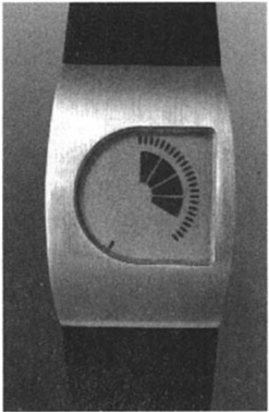
The value of this watch comes from the clever representation of time: Quick, what time is represented? This is Time by Design's "Pie" watch showing the time of 4:22 and 37 seconds. The goal of the company is to invent new ways of telling time, combiing "art and time telling into amusing and thought provoking clocks and watches." This watch is as much a statement about the wearer as it is a timepiece.
(Courtesy of Time by Design.)
FIGURE 3.6
it is about the meaning of things, the personal remembrances something evokes. For another, very different thing, it is about self-image and the message a product sends to others. Whenever you notice that the color of someone's socks matches the rest of his or her clothes or whether those clothes are right for the occasion, you are concerned with reflective self-image.
Whether we wish to admit it or not, all of us worry about the image we present to others-or, for that matter, about the self-image that we present to ourselves. Do you sometimes avoid a purchase "because it wouldn't be right" or buy something in order to support a cause you prefer? These are reflective decisions. In fact, even people who claim a complete lack of interest in how they are perceived-dressing in whatever is easiest or most comfortable, refraining from purchasing new items until the ones they are using completely stop workingmake statements about themselves and the things they care about. These are all properties of reflective processing.
Consider two watches. The first one, by "Time by Design" (figure 3.6), exhibits reflective delight in using an unusual means to display time, one that has to be explained to be understood. The watch is also viscerally attractive, but the main appeal is its unusual display. Is the time more difficult to read than on a traditional analog or digital
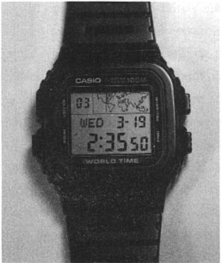
FIGURE 3.7
Pure behavioral design.
The Casio "G-Shock" watch is pure behavioral design; efficient and effective, with no claims to beauty and low in such measures of reflective design as prestige and status. But consider the behavioral aspects: two time zones, a stopwatch, a countdown timer, and an alarm. Inexpensive, easy to use, and accurate.
(Author's collection.)
watch? Yes, but it has an excellent underlying conceptual model, satisfying one of my maxims of good behavioral design: it need only be explained once; from then on, it is obvious. Is it awkward to set the watch because it has but a single control? Yes, but the reflective delight in showing off the watch and explaining its operation outweighs the difficulties. I own one myself and, as my weary friends will attest, proudly explain it to anyone who shows the slightest bit of interest. The reflective value outweighs the behavioral difficulties.
Now contrast this reflective design with the practical, sensible, plastic digital watch by Casio (figure 3.7). This is a practical watch, one emphasizing the behavioral level of design without any attributes of visceral or reflective design. This is an engineer's watch: practical, straightforward, multiple features, and low price. It isn't particularly attractive-that isn't its selling point. Moreover, the watch has no special reflective appeal, except perhaps through the reverse logic of being proud to own such a utilitarian watch when one can afford a much more expensive one. (For the record, I own both these watches, wearing the Time by Design one for formal affairs, the Casio otherwise.)
A number of years ago I visited Biel, Switzerland. I was part of a small product team for an American high-technology company, there
to talk with the folks at Swatch, the watch company that had transformed the Swiss watchmaking industry. Swatch, we were proudly told, was not a watch company; it was an emotions company. Sure, they made the precision watches and movements used in most watches around the world (regardless of the brand displayed on the case), but what they had really done was to transform the purpose of a watch from timekeeping to emotion. Their expertise, their president boldly proclaimed, was human emotion, as he rolled up his sleeves to display the many watches on his arm.
Swatch is famous for transforming the watch into a fashion statement, arguing that people should own as many watches as ties, or shoes, or even shirts. You should change your watch, they proclaimed, to match mood, activity, or even the time of day. The executive team of Swatch patiently tried to explain this to us: Yes, the watch mechanism had to be inexpensive, yet of high quality and reliable (and we were very impressed by our tour of their completely automated manufacturing facilities), but the real opportunities lay in exploiting the face and body of the watch. Their web site puts it like this:
Swatch Is Design. The form of a Swatch watch is always the same. The tiny space it offers for creative design exerts an irresistible power of attraction on artists. Why? Because the watch face and strap can take on the wildest imaginative concepts, the most unusual ideas, brilliant colors, rousing messages, art and comics, dreams for today and tomorrow, and much, much more. And that's exactly what makes each Swatch model so fascinating: it is design that incorporates a message, handwriting that bears witness to a personality.
At the time of my visit, we were impressed, but puzzled. We were technologists. The concept that a piece of advanced technology should really be thought of as a vehicle for emotions rather than for function was a bit difficult for us engineers to fathom. Our group could never get its act together enough to work in such a creative way, so nothing ever came of that venture-except for the long-lasting impression it
made on me. I learned that products can be more than the sum of the functions they perform. Their real value can be in fulfilling people's emotional needs, and one of the most important needs of all is to establish one's self-image and one's place in the world. In his important book about the role of industrial design, Watches Tell More than Time, the designer Del Coates explains that "it is impossible, in fact, to design a watch that tells only time. Knowing nothing more, the design of a watch alone-or of any product-can suggest assumptions about the age, gender, and outlook of the person who wears it."
Did you ever consider buying an expensive, hand-crafted watch? Expensive jewelry? Single malt scotch or a prestige vodka? Can you really distinguish among the brands? Blind-tasting of many whiskeys, where the taster has no idea which glass contains which drink, reveals that you probably can't taste the difference. Why is an expensive original painting superior to a high-quality reproduction? Which would you prefer to have? If the painting is about aesthetics, then a good reproduction should suffice. But, obviously, paintings are more than aesthetics: they are about the reflective value of owning-or viewing-the original.
These questions are all cultural. There is nothing practical, nothing biological, about the answers. The answers are conventions, learned in whatever society you inhabit. For some of you, the answers will be obvious; for others, the questions will not even make sense. That is the essence of reflective design: it is all in the mind of the beholder.
Attractiveness is a visceral-level phenomenon-the response is entirely to the surface look of an object. Beauty comes from the reflective level. Beauty looks below the surface. Beauty comes from conscious reflection and experience. It is influenced by knowledge, learning, and culture. Objects that are unattractive on the surface can give pleasure. Discordant music, for example, can be beautiful. Ugly art can be beautiful.
Advertising can work at either the visceral or the reflective level. Pretty products-sexy automobiles, powerful-looking trucks, seductive bottles for drinks and perfume-play with the visceral level.
Prestige, perceived rarity, and exclusiveness work at the reflective level. Raise the price of Scotch, and increase the sales. Make it difficult to get reservations to a restaurant or entrance to a club, and increase their desirability. These are reflective-level ploys.
Reflective-level operations often determine a person's overall impression of a product. Here, you think back about the product, reflecting upon its total appeal and the experience of using it. Here is where many factors come into play and where the deficiencies of one aspect can be outweighed by the strengths of another. Minor difficulties might very well be overlooked in the overall assessment-or enhanced, blown all out of proportion.
The overall impact of a product comes through reflection-in retrospective memory and reassessment. Do you fondly show your possessions to friends and colleagues, or do you hide them and, if you talk at all, is it only to complain? Things that an owner is proud of will be displayed prominently, or, at the least, shown to people.
Customer relationships play a major role at the reflective level, so much so that a good relationship can completely reverse an otherwise negative experience with the product. Thus, a company that goes out of its way to assist and help disgruntled customers can often turn them into its most loyal fans. Indeed, the person who buys a product and has nothing but pleasant experiences with it may be less satisfied than the one who has an unhappy experience, but is well treated by the company as it fixes the problem. This is an expensive way to win customer loyalty, but it shows the power of the reflective level. Reflective design is really about long-term customer experience. It is about service, about providing a personal touch and a warm interaction. When a customer reflects on the product in order to decide what next to purchase or to advise friends, a pleasant reflective memory can overcome any prior negative experiences.
Amusement park rides are a good example of the interplay between reflection and reaction. The ride appeals both to those who value the feelings that accompany high arousal and fear for its own sake and to those for whom the ride is all about the reflective power afterward. At
the visceral level, the whole point is to thrill riders, scaring them in the process. But this has to be done in a reassuring way. While the visceral system is operating at full force, the reflective system is a calming influence. This is a safe ride, it is telling the rest of the body. It only appears to be dangerous. It is okay. During the ride, the visceral system probably wins. But in retrospect, when memory has dimmed, the reflective system wins. Now,it is a badge of honor to have experienced the ride. It provides stories to tell other people. Here an effective amusement park enhances the interaction by selling photographs of the rider at the peak of the experience. They sell photographs and souvenirs, so the riders can brag to friends.
Would you go on a ride if the amusement park was old and shabby, with clearly broken components, rusty railings, and a general air of incompetence? Obviously not. The rational reassurance will not be nearly as effective. Once the reflective system fails, then the appeal is apt to collapse as well.
A Case Study: The National Football League Headset
"You know what the hardest part of this design was?" Walter Herbst, of the design firm Herbst LaZar Bell, asked, proudly showing me the Motorola headset (figure 3.8).
"Reliability?" I answered, hesitantly, thinking that it looked so big and strong, it must be reliable.
"Nope," he answered, "it was the coaches-making the coaches feel good about wearing it."
Motorola had asked Herbst LaZar Bell to design the headset to be used by the coaches of the National Football League. Mind you,these couldn't be just any headset. They had to be highly functional, delivering intelligible messages between coaches and their staff scattered about the stadium. The microphone boom had to be movable so that it could be placed on either side of the head for left-handed and right-
FIGURE 3.8
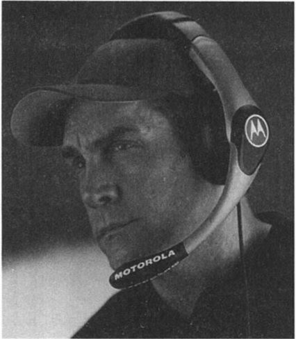
Motorola's headset for the coaching staff of the National Football League.
The headset was designed by the industrial design firm Herbst LaZar Bell, which won a Gold Prize from both Business Week's Industrial Design Excellence Awards and the Industrial Design Society of America (IDSA) for their achievement. IDSA described the reasons this way:"lt's a rare moment when a design team realizes that it has been given the green light to create an icon-one that will be seen by millions around the world. The Motorola NFL Headset represents the marriage of sophisticated communications technology and great design with the blood, sweat and tears on the field of play. In addition, it enhances awareness of a company committed to delivering on the demanding requirements of professional users in every arena." (Courtesy of Herbst LaZar Bell and Motorola, Inc.)
handed coaches. The environment is a difficult one. It is noisy. Football games are played in temperature extremes, from high heat, to rain, to extreme cold. And headsets get abused: angry coaches take out their frustration on whatever happens to be around, sometimes grabbing hold of the microphone boom and throwing the headset to the ground. The signals have to be private so opposing teams cannot
eavesdrop. The headset is also an important advertising symbol, exposing the Motorola name to television viewers, so the brand name has to be visible regardless of camera angle. And finally, the coaches have to be satisfied. They have to want to use it. So not only does the headset have to stand up to the rigors of the game, it has to be comfortable to wear for hours at a time.
The headset design was a challenge. Small, lightweight headsets, though more comfortable, are not strong enough. More importantly, though, coaches rejected them. The coaches are the leaders of a large, active team. Football players are among the largest, most muscular players in team sports. The headset had to reinforce this image: it had to be muscular itself to convey the image of a coach in charge of things.
So, yes, the design had to have visceral appeal; and, yes, it had to meet the behavioral objectives. The biggest challenge, however, was to do all this while satisfying the coaches, projecting the heroic, manly self-image of strong, disciplined leaders who managed the world's toughest players, and who were always in control. In short: reflective design.
Accomplishing all this took a lot of work. This was not a design to be scribbled on the side of a napkin (although a lot of trial designs were, in fact, done on napkins). Sophisticated computer-aided drawing tools that allowed the designers to visualize just how the headset looked from all angles before anything had been built, optimizing the interaction of ear cups and microphone, headband adjustment, and even the placement of the logos (maximizing their visibility to the TV audience while simultaneously minimizing it to the coaches, to avoid distraction).
"The main goal in designing the Coaches Headset," said Steve Remy, project manager for Herbst LaZar Bell, "was to create a cool new look for the product that is often overlooked as a background item, and turn it into an image-building product that attracts the viewer's attention even in the high energy, action-packed context of the professional football game." It worked. The result is a "cool" product-one that not only functions well, but also serves as an effective
advertising tool for Motorola and enhances the self-image of the coaches. This is an excellent example of how the three different aspects of design can work well with one another.
The Devious Side of Design
To the uninitiated, walking into the Diesel jeans store on Union Square West feels a lot like stumbling into a rave. Techno music pounds at a mind-rattling level. A television plays a videotape of a Japanese boxing match, inexplicably. There are no helpful signs pointing to men's or women's departments, and no obvious staff members in sight.
While large clothing retailers like Banana Republic and Gap have standardized and simplified the layout of their stores in an effort to put customers at ease, Diesel's approach is based on the unconventional premise that the best customer is a disoriented one.
"We 're conscious of the fact that, outwardly, we have an intimidating environment," said Niall Maher, Diesel's director of retail operations. "We didn't design our stores to be user-friendly because we want you to interact with our people. You can't understand Diesel without talking to someone."
Indeed, it is at just the moment when a potential Diesel customer reaches a kind of shopping vertigo that members of the company's intimidatingly with-it staff make their move. Acting as salesmen-inshining-armor, they rescue-or prey upon, depending on one's point of view-wayward shoppers.
-Warren St. John, New York Times
To the practitioner of human-centered design, serving customers means relieving them of frustration, of confusion, of a sense of helplessness. Make them feel in control and empowered. To the clever salesperson, just the reverse is true. If people don't really know what they want, then what is the best way to satisfy their needs? In the case
of human-centered design, it is to provide them with the tools to explore by themselves, to try this and that, to empower themselves to success. To the sales staff, this is an opportunity to present themselves as rescuers "in-shining-armor," ready to offer assistance, to provide just the answer customers will be led to believe they had been seeking.
In the world of fashion-which encompasses everything from clothes to restaurants, automobiles to furniture-who is to say which approach is right, which wrong? The solution through confusion is a pure play on emotions, selling you, the customer, the idea that the proposed item will precisely serve your needs and, more important, advertise to the rest of the world what a superior, tasteful, "with it" person you are. And, if you believe it, it will probably come to pass, for strong emotional attachment provides the mechanism for selffulfilling prophecy.
So, again, which approach is right: that of the Gap and Banana Republic, which "have standardized and simplified the layout of their stores in an effort to put customers at ease"; or Diesel, which deliberately confuses and intimidates, the better to prepare the customer to welcome the helpful, reassuring salesperson? I know my preferences; I'll go with Gap and Banana Republic any day, but the very success of Diesel shows that not everyone shares this view. In the end, the stores serve different needs. The first two stores are more utilitarian (although they would shudder to be called that); the second pure fashion, where the whole goal is caring about what others think.
"When you're wearing a thousand-dollar suit," super salesman Mort Spivas told the media critic Douglass Rushkoff, "you project a different aura. And then people treat you differently. You exude confidence. And if you can feel confident, you'll act confident." If salespeople believe that wearing an expensive suit makes them different, then it does make them different. For fashion, emotions are key. Stores that manipulate emotions are simply playing the game consumers have invited themselves into. Now, the fashion world may have inappropriately brainwashed the eager public into believing that the game counts, but that is the belief, nonetheless.
To disconcert shoppers as a selling tool is hardly news. Supermarkets long ago learned to put the most frequently desired items at the rear of the store, forcing buyers to pass by isles of tempting impulse purchases. Moreover, related items can be placed nearby. Do people rush to the store to buy milk? Put the milk at the rear of the store, and put cookies nearby. Do they rush in to buy beer? Put the beer next to snacks. Similarly, at the checkout counter, display the small, last-minute items people might be tempted to buy while waiting in line. Creating these "point of purchase" displays has become a big business. I can even imagine stores deliberately slowing up the checkout procedure to give customers more time to make those last-minute, impulse purchases.
Once a customer has learned the shop or shelf layout, it is time to redo it, goes this marketing philosophy. Otherwise, a shopper wanting a can of soup will simply go directly to the soup and not notice any of the other enticing items. Rearranging the store forces the shopper to explore previously unvisited aisles. Similarly, rearranging how the soups are stored prevents the shopper from buying the same type of soup each time without ever trying any other variety. So shelves get rearranged, and related items are put nearby. Stores get restructured, and the most popular items are placed at the furthest ends of the store, with impulse items placed either adjacent or at the "end caps," the ends of the aisles where they are most visible. There is a perverse set of usability principles at play here: make it difficult to buy the most desired items, and extremely easy for the impulse items.
When these tricks are used, it is critically important that the shopper not notice. Make the store layout appear normal. Indeed, make the disorientation part of the fun. Diesel gets away with their confusion because they are famous for it, because their clothes are very popular, and because wandering through the store is part of the experience. The same philosophy would not work for a hardware store. In the supermarket, the fact that milk or beer is at the farthest end of the store doesn't appear deliberate, it seems natural. After all, the coolers
are there at the back, which is where these items are kept. Of course, no one ever asks the real question, Why are the coolers located there?
Once shoppers realize that they are being manipulated in these ways, a backlash may occur whereby shoppers desert the manipulative stores and visit the ones that make their experiences more pleasant. Stores that try to profit through confusion often enjoy a meteoric rise in sales and popularity, but suffer a similar meteoric fall as well. The staid, conventional, helpful store is more stable, with neither the great ups nor the great downs in popularity. Yes, shopping can be a sensual, emotional experience, but it can also be a negative, traumatic one. But when stores do things correctly, when they understand "The Science of Shopping," to use the subtitle of Paco Underbill's book, then the experience can be both a positive emotional one for the shopper and a profitable one for the seller.
Just as the scary rides of an amusement park pit the anxiety and fear of the visceral level against the calm reassurance of the intellect, the Diesel store pits the initial confusion and anxiety at both the behavioral and reflective levels against the relief and welcome of the rescuing sales person. In both cases, the initial negative affect is necessary to set up the relief and delight at the end. In the park, the ride is now safely over, and the rider can reflect upon all the positive experiences of having successfully mastered the adventure. In the store, the relieved customer reflects back upon the calm guidance and reassurance offered by the salesperson. In the store, the customer is apt to bond with the salesperson, not unlike the "Stockholm syndrome," in which kidnap victims develop such a positive emotional bond with their captors that, after they are freed and the captors in custody, they plead for mercy for the kidnappers. (The name comes from a bank robbery in the early 1970s in Stockholm, Sweden, where a hostage developed a romantic attachment to one of her captors.) But there is a real difference between these two cases. In the amusement park, the fear and excitement is the draw. It is public, advertised. In the Diesel store, it is artificial, manipulative. One is natural, the other not. Guess which will last over time.
Design by Committee Versus by an Individual
Although reflective thought is the essence of great literature and art, films and music, web sites and products, appealing to the intellect is no guarantee of success. Many well-acclaimed serious works of art and music are relatively unintelligible to the average person. I suspect they may even be unintelligible to those who proclaim them, for in the exalted realm of literature, art, and professional criticism, it would appear that when something can be clearly understood, it is judged as flawed, whereas when something is impenetrable, it must of necessity be good. And some items convey such subtle, hidden intellectual messages, that they are lost on the average viewer or user, perhaps lost on everyone except the creator and dutiful students in universities, listening to the learned critiques from their professors.
Consider the fate of Fritz Lang's classic film "Metropolis," "a wildly ambitious, hugely expensive science fiction allegory of filial revolt, romantic love, alienated labor and dehumanizing technology." It was first shown in Berlin in 1926 but the American distributor, Paramount Films, complained that it was unintelligible. They hired Channing Pollock, a playwright, to reedit the film. Pollock complained that "symbolism ran such riot that people who saw it couldn't tell what the picture was all about." Whether or not one agrees with Pollock's criticism, there is no doubt that too much intellectualism can certainly get in the way of pleasure and enjoyment. (Which, of course, is often beside the point: The purpose of a serious essay, movie, or piece of art is to educate and inform, not to amuse.)
There is a fundamental conflict between the preferences of the popular audience and the desires of the intellectual and artistic community. The case is most easily made with respect to movies, but also applies to all design as well as to serious music, art, literature, drama, and television.
Making a movie is a complex process. Hundreds of people are ulti-
mately involved, with layers of producers, directors, screenwriters, cameramen, editors, and studio executives all having some legitimate say in the end product. Artistic integrity, a cohesive thematic approach, and deep substance seldom come from committees. The best designs come from following a cohesive theme throughout, with a clear vision and focus. Usually, such designs are driven by the vision of one person.
You may think that I am contradicting one of my standard design rules: test and redesign, test and redesign. I have long championed human-centered design, where a product undergoes continual revision based upon tests with potential users of the product. This is a time-tested, effective method for producing usable products whose end result fits the needs of the largest number of people. Why do I now claim that a single designer who has a clear model of the end product and ensures that it gets developed can be superior to that cautious design cycle of design, test, and then redesign?
The difference is that all my previous work focused upon behavioral design. I still maintain that an iterative, human-centered approach works well for behavioral design, but it is not necessarily appropriate for either the visceral or the reflective side. When it comes to these levels, the iterative method is design by compromise, by committee, and by consensus. This guarantees a result that is safe and effective, but invariably dull.
This is what happens with movies. Movie studio executives often subject movies to screen tests, where a film is shown to a test audience and their reactions gauged. As a result, scenes are deleted, story lines changed. Frequently an ending is changed to make it more comfortable to the viewers. All of this is done to increase the popularity and sales of the movie. The problem is that the director, cameramen, and writers are apt to feel that the changes have destroyed the soul of the film. Who to believe? I suspect both the test results and the opinions of the creative crew are valid.
Films are judged by a variety of standards. On the one hand, even an "inexpensive" film can cost millions of dollars to produce, while an
expensive one can cost hundreds of millions. A film can be both a major business investment and an artistic statement.
Business versus art or literature: the debate is real and appropriate. In the end, the decision is whether one wishes to be an artist making a statement, in which case profits are irrelevant, or a business person, changing the film or product to make it appeal to as many people as possible, even at the cost of artistic merit. Want a popular film, one that appeals to the masses? Show the film to test audiences and revise. Want an artistic masterpiece? Hire a great creative crew that you can trust.
Henry Lieberman, a research scientist at the MIT Media Laboratory has described the case against "design by committee" most eloquently, so let me simply repeat his words here:
The brilliant conceptual artists Vitaly Komar and Alex Melamid conducted surveys asking people questions like, What's your favorite color? Do you prefer landscapes to portraits? Then they produced exhibitions of perfectly "user-centered art." The results were profoundly disturbing. The works were completely lacking in innovation or finesse of craftsmanship, disliked even by the very same survey respondents. Good art is not an optimal point in a multidimensional space; that was, of course, their point. Perfectly "user-centered design" would be disturbing as well, precisely because it would lack that artistry.
One thing is certain, this debate is fundamental: it will continue as long as the creators of art, music, and performance are not the same people as those who must pay to get them distributed to the world. If you want a successful product, test and revise. If you want a great product, one that can change the world, let it be driven by someone with a clear vision. The latter presents more financial risk, but it is the only path to greatness.