From Buccaneers to Guinea Pigs: The Genesis of Causal Inference
And yet it moves.
-ATTRIBUTED TO GALILEO GALILEI (1564-1642)
FOR close to two centuries, one of the most enduring rituals in British science has been the Friday Evening Discourse at the Royal Institution of Great Britain in London. Many discoveries of the nineteenth century were first announced to the public at this venue: Michael Faraday and the principles of photography in 1839; J. J. Thomson and the electron in 1897; James Dewar and the liquefaction of hydrogen in 1904.
Pageantry was an important part of the occasion; it was literally science as theater, and the audience, the cream of British society, would dress to the nines (tuxedos with black tie for men). At the appointed hour, a chime would strike, and the evening's speaker would be ushered into the auditorium. Traditionally he would begin the lecture immediately, without introduction or preamble. Experiments and live demonstrations were part of the spectacle.
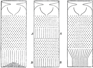
On February 9, 1877, the evening's speaker was Francis Galton, FRS, first cousin of Charles Darwin, noted African explorer, inventor of fingerprinting, and the very model of a Victorian gentleman scientist. Galton's title was 'Typical Laws of Heredity.' His experimental apparatus for the evening was a curious contraption that he called a quincunx, now often called a 'Galton board.' A similar game has often appeared on the televised game show The Price Is Right, where it is known as Plinko. The Galton board consists of a triangular array of pins or pegs, into which small metal balls can be inserted through an opening at the top. The balls bounce downward from one row to the next, pinball style, before settling into one of a line of slots at the bottom (see frontispiece). For any individual ball, the zigs and zags to the left or right look completely random. However, if you pour a lot of balls into the Galton board, a startling regularity emerges: the accumulated balls at the bottom will always form a rough approximation to a bell-shaped curve. The slots nearest the center will be stacked high with balls, and the number of the balls in each slot gradually tapers down to zero at the edges of the quincunx.
This pattern has a mathematical explanation. The path of any individual ball is like a sequence of independent coin flips. Each time a ball hits a pin, it bounces either to the left or the right, and from a distance its choice seems completely random. The sum of the results—say, the excess of the rights over the lefts—determines which slot the ball ends up in. According to the central limit theorem, proven in 1810 by Pierre-Simon Laplace, any such random process—one that amounts to a sum of a large number of coin flips—will lead to the same probability distribution, called the normal distribution (or bell-shaped curve). The Galton board is simply a visual demonstration of Laplace's theorem.
The central limit theorem is truly a miracle of nineteenth-century mathematics. Think about it: even though the path of any individual ball is unpredictable, the path of 1,000 balls is extremely predictable—a convenient fact for the producers of The Price Is Right, who can estimate accurately how much money the contestants will win at Plinko over the long run. This is the same law that makes insurance companies so profitable, despite the uncertainties in human affairs.
The well-dressed audience at the Royal Institute must have wondered what all this had to do with the laws of heredity, the promised lecture topic. To illustrate the connection, Galton showed them some data collected in France on the heights of military recruits. These also follow a normal distribution: many men are of about average height, with a gradually diminishing number who are either extremely tall or extremely short. In fact, it does not matter whether you are talking about 1,000 military recruits or 1,000 balls in the Galton board: the numbers in each slot (or height category) are almost the same.
Thus, to Galton, the quincunx was a model for the inheritance of stature or, indeed, many other genetic traits. It is a causal model. In simplest terms, Galton believed the balls 'inherit' their position in the quincunx in the same way that humans inherit their stature.
But if we accept this model—provisionally—it poses a puzzle, which was Galton's chief subject for the evening. The width of the bell-shaped curve depends on the number of rows of pegs placed between the top and the bottom. Suppose we doubled the number of rows. This would create a model for two generations of inheritance, with the first half of the rows representing the first generation and the second half representing the second. You would inevitably find more variation in the second generation than in the first, and in succeeding generations, the bell-shaped curve would get wider and wider still.
But this is not what happens with actual human stature. In fact, the width of the distribution of human heights stays relatively constant over time. We didn't have nine-foot humans a century ago, and we still don't. What explains the stability of the population's genetic endowment? Galton had been puzzling over this enigma for roughly eight years, since the publication of his book Hereditary Genius in 1869.
As the title of the book suggests, Galton's true interest was not carnival games or human stature but human intelligence. As a member of an extended family with a remarkable amount of scientific genius, Galton naturally would have liked to prove that genius runs in families. And he had set out to do exactly that in his book. He painstakingly compiled pedigrees of 605 'eminent' Englishmen from the preceding four centuries. But he found that the sons and fathers of these eminent men were somewhat less eminent and the grandparents and grandchildren less eminent still.
It's easy enough for us now to find flaws in Galton's program. What, after all, is the definition of eminence? And isn't it possible that people in eminent families are successful because of their privilege rather than their talent? Though Galton was aware of such difficulties, he pursued this futile quest for a genetic explanation at an increasing pace and determination.
Still, Galton was on to something, which became more apparent once he started looking at features like height, which are easier to measure and more strongly linked to heredity than 'eminence.' Sons of tall men tend to be taller than average—but not as tall as their fathers. Sons of short men tend to be shorter than average—but not as short as their fathers. Galton first called this phenomenon 'reversion' and later 'regression toward mediocrity.' It can be noted in many other settings. If students take two different standardized tests on the same material, the ones who scored high on the first test will usually score higher than average on the second test but not as high as they did the first time. This phenomenon of regression to the mean is ubiquitous in all facets of life, education, and business. For instance, in baseball the Rookie of the Year (a player who does unexpectedly well in his first season) often hits a 'sophomore slump,' in which he does not do quite as well.
Galton didn't know all of this, and he thought he had stumbled onto a law of heredity rather than a law of statistics. He believed that regression to the mean must have some cause, and in his Royal Institution lecture he illustrated his point. He showed his audience a two-layered quincunx (Figure 2.1).
After passing through the first array of pegs, the balls passed through sloping chutes that moved them closer to the center of the board. Then they would pass through a second array of pegs. Galton showed triumphantly that the chutes exactly compensated for the tendency of the normal distribution to spread out. This time, the bell-shaped probability distribution kept a constant width from generation to generation.
FIGURE 2.1. The Galton board, used by Francis Galton as an analogy for the inheritance of human heights. (a) When many balls are dropped through the pinball-like apparatus, their random bounces cause them to pile up in a bell-shaped curve. (b) Galton noted that on two passes, A and B , through the Galton board (the analogue of two generations) the bell-shaped curve got wider. (c) To counteract this tendency, he installed chutes to move the 'second generation' back closer to the center. The chutes are Galton's causal explanation for regression to the mean.
( Source: Francis Galton, Natural Inheritance [1889].)
Thus, Galton conjectured, regression toward the mean was a physical process, nature's way of ensuring that the distribution of height (or intelligence) remained the same from generation to generation. 'The process of reversion cooperates with the general law of deviation,' Galton told his audience. He compared it to Hooke's law, the physical law that describes the tendency of a spring to return to its equilibrium length.
Keep in mind the date. In 1877, Galton was in pursuit of a causal explanation and thought that regression to the mean was a causal process, like a law of physics. He was mistaken, but he was far from alone. Many people continue to make the same mistake to this day. For example, baseball experts always look for causal explanations for a player's sophomore slump. 'He's gotten overconfident,' they complain, or 'the other players have figured out his weaknesses.' They may be right, but the sophomore slump does not need a causal explanation. It will happen more often than not by the laws of chance alone.
The modern statistical explanation is quite simple. As Daniel Kahneman summarizes it in his book Thinking, Fast and Slow, 'Success = talent + luck. Great success = a little more talent + a lot of luck.' A player who wins Rookie of the Year is probably more talented than average, but he also (probably) had a lot of luck. Next season, he is not likely to be so lucky, and his batting average will be lower.
By 1889, Galton had figured this out, and in the process—partly disappointed but also fascinated—he took the first huge step toward divorcing statistics from causation. His reasoning is subtle but worth making the effort to understand. It is the newborn discipline of statistics uttering its first cry.
Galton had started gathering a variety of 'anthropometric' statistics: height, forearm length, head length, head width, and so on. He noticed that when he plotted height against forearm length, for instance, the same phenomenon of regression to the mean took place. Tall men usually had longer-than-average forearms—but not as far above average as their height. Clearly height is not a cause of forearm length, or vice versa. If anything, both are caused by genetic inheritance. Galton started using a new word for this kind of relationship: height and forearm length were 'co-related.' Eventually, he opted for the more normal English word 'correlated.'
Later he realized an even more startling fact: in generational comparisons, the temporal order could be reversed. That is, the fathers of sons also revert to the mean. The father of a son who is taller than average is likely to be taller than average but shorter than his son (see Figure 2.2). Once Galton realized this, he had to give up any idea of a causal explanation for regression, because there is no way that the sons' heights could cause the fathers' heights.
This realization may sound paradoxical at first. 'Wait!' you're saying. 'You're telling me that tall dads usually have shorter sons, and tall sons usually have shorter dads. How can both of those statements be true? How can a son be both taller and shorter than his father?'
FIGURE 2.2. The scatter plot shows a data set of heights, with each dot representing the height of a father (on the x -axis) and his son (on the y -axis). The dashed line coincides with the major axis of the ellipse, while the solid line (called the regression line) connects the rightmost and leftmost points on the ellipse. The difference between them accounts for regression to the mean. For example, the black star shows that 72" fathers have, on the average, 71" sons. (That is, the average height of all the data points in the vertical strip is 71".) The horizontal strip and white star show that the same loss of height occurs in the noncausal direction (backward in time). ( Source: Figure by Maayan Harel, with a contribution from Christopher Boucher.)
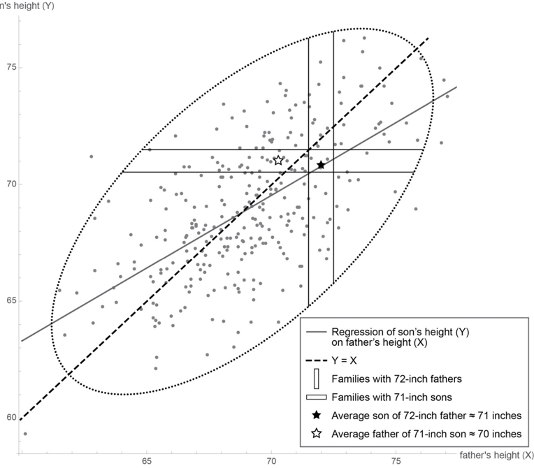
The answer is that we are talking not about an individual father and an individual son but about two populations. We start with the population of six-foot fathers. Because they are taller than average, their sons will regress toward the mean; let's say their sons average five feet, eleven inches. However, the population of father-son pairs with six-foot fathers is not the same as the population of father-son pairs with five-foot-eleven-inch sons. Every father in the first group is by definition six feet tall. But the second group will have a few fathers who are taller than six feet and a lot of fathers who are shorter than six feet. Their average height will be shorter than five feet, eleven inches, again displaying regression to the mean.
Another way to illustrate regression is to use a diagram called a scatter plot (Figure 2.2). Each father-son pair is represented by one dot, with the x-coordinate being the father's height and the y-coordinate being the son's height. So a father and son who are both five feet, nine inches (or sixty-nine inches) will be represented by a dot at (69, 69), right at the center of the scatter plot. A father who is six feet (or seventy-two inches) with a son who is five-foot-eleven (or seventy-one inches) will be represented by a dot at (72, 71), in the northeast corner of the scatter plot. Notice that the scatter plot has a roughly elliptical shape—a fact that was crucial to Galton's analysis and characteristic of bell-shaped distributions with two variables.
As shown in Figure 2.2, the father-son pairs with seventy-two-inch fathers lie in a vertical slice centered at 72; the father-son pairs with seventy-one-inch sons lie in a horizontal slice centered at 71. Here is visual proof that these are two different populations. If we focus only on the first population, the pairs with seventy-two-inch fathers, we can ask, 'How tall are the sons on average?' It's the same as asking where the center of that vertical slice is, and by eye you can see that the center is about 71. If we focus only on the second population with seventy-one-inch sons, we can ask, 'How tall are the fathers on average?' This is the same as asking for the center of the horizontal slice, and by eye you can see that its center is about 70.3.
We can go farther and think about doing the same procedure for every vertical slice. That's equivalent to asking, 'For fathers of height x, what is the best prediction of the son's height (y)?' Alternatively, we can take each horizontal slice and ask where its center is: for sons of height y, what is the best 'prediction' (or retrodiction) of the father's height?
As he thought about this question, Galton stumbled on an important fact: the predictions always fall on a line, which he called the regression line, which is less steep than the major axis (or axis of symmetry) of the ellipse (Figure 2.3). In fact there are two such lines, depending on which variable is being predicted and which is being used as evidence. You can predict the son's height based on the father's or the father's based on the son's. The situation is completely symmetric. Once again this shows that where regression to the mean is concerned, there is no difference between cause and effect.
The slope of the regression enables you to predict the value of one variable, given that you know the value of the other. In the context of Galton's problem, a slope of 0.5 would mean that each extra inch of height for the father would correspond, on average, to an extra half inch for the son, and vice versa. A slope of 1 would be perfect correlation, which means every extra inch for the father is passed deterministically to the son, who would also be an inch taller. The slope can never be greater than 1; if it were, the sons of tall fathers would be taller on average, and the sons of short fathers would be shorter—and this would force the distribution of heights to become wider over time. After a few generations we would start having 9-foot people and 2-foot people, which is not observed in nature. So, provided the distribution of heights stays the same from one generation to the next, the slope of the regression line cannot exceed 1.
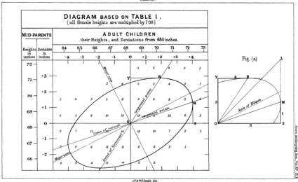
FIGURE 2.3. Galton's regression lines. Line OM gives the best prediction of a son's height if you know the height of the father; line ON gives the best prediction of a father's height if you know the height of the son. Neither is the same as the major axis (axis of symmetry) of the scatter plot. ( Source: Francis Galton, Journal of the Anthropological Institute of Great Britain and Ireland [1886], 246-263, Plate X.)
The law of regression applies even when we correlate two different quantities, like height and IQ. If you plot one quantity against the other in a scatter plot and rescale the two axes properly, then the slope of the best-fit line always enjoys the same properties. It equals 1 only when one quantity can predict the other precisely; it is 0 whenever the prediction is no better than a random guess. The slope (after scaling) is the same no matter whether you plot X against Y or Y against X. In other words, the slope is completely agnostic as to cause and effect. One variable could cause the other, or they could both be effects of a third cause; for the purpose of prediction, it does not matter.
For the first time, Galton's idea of correlation gave an objective measure, independent of human judgment or interpretation, of how two variables are related to one another. The two variables can stand for height, intelligence, or income; they can stand in causal, neutral, or reverse-causal relation. The correlation will always reflect the degree of cross predictability between the two variables. Galton's disciple Karl Pearson later derived a formula for the slope of the (properly rescaled) regression line and called it the correlation coefficient. This is still the first number that statisticians all over the world compute when they want to know how strongly two different variables in a data set are related. Galton and Pearson must have been thrilled to find such a universal way of describing the relationships between random variables. For Pearson, especially, the slippery old concepts of cause and effect seemed outdated and unscientific, compared to the mathematically clear and precise concept of a correlation coefficient.
Galton and the Abandoned Quest
It is an irony of history that Galton started out in search of causation and ended up discovering correlation, a relationship that is oblivious of causation. Even so, hints of causal thinking remained in his writing. 'It is easy to see that correlation [between the sizes of two organs] must be the consequence of the variations of the two organs being partly due to common causes,' he wrote in 1889.
The first sacrifice on the altar of correlation was Galton's elaborate machinery to explain the stability of the population's genetic endowment. The quincunx simulated the creation of variations in height and their transmission from one generation to the next. But Galton had to invent the inclined chutes in the quincunx specifically to rein in the ever-growing diversity in the population. Having failed to find a satisfactory biological mechanism to account for this restoring force, Galton simply abandoned the effort after eight years and turned his attention to the siren song of correlation. Historian Stephen Stigler, who has written extensively about Galton, noticed this sudden shift in Galton's aims and aspirations: 'What was silently missing was Darwin, the chutes, and all the 'survival of the fittest.'… In supreme irony, what had started out as an attempt to mathematize the framework of the Origin of Species ended with the essence of that great work being discarded as unnecessary!'
But to us, in the modern era of causal inference, the original problem remains. How do we explain the stability of the population, despite Darwinian variations that one generation bestows on the next?
Looking back on Galton's machine in the light of causal diagrams, the first thing I notice is that the machine was wrongly constructed. The ever-growing dispersion, which begged Galton for a counterforce, should never have been there in the first place. Indeed, if we trace a ball dropping from one level to the next in the quincunx, we see that the displacement at the next level inherits the sum total of variations bestowed upon it by all the pegs along the way. This stands in blatant contradiction to Kahneman's equations:
Success = talent + luck
Great success = A little more talent + a lot of luck.
According to these equations, success in generation 2 does not inherit the luck of generation 1. Luck, by its very definition, is a transitory occurrence; hence it has no impact on future generations. But such transitory behavior is incompatible with Galton's machine.
To compare these two conceptions side by side, let us draw their associated causal diagrams. In Figure 2.4(a) (Galton's conception), success is transmitted across generations, and luck variations accumulate indefinitely. This is perhaps natural if 'success' is equated to wealth or eminence. However, for the inheritance of physical characteristics like stature, we must replace Galton's model with that in Figure 2.4(b). Here only the genetic component, shown here as talent, is passed down from one generation to the next. Luck affects each generation independently, in such a way that the chance factors in one generation have no way of affecting later generations, either directly or indirectly.
FIGURE 2.4. Two models of inheritance. (a) The Galton board model, in which luck accrues from generation to generation, leading to an ever-wider distribution of success. (b) A genetic model, in which luck does not accrue, leading to a constant distribution of success.
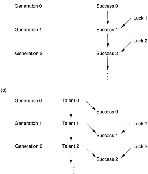
Both of these models are compatible with the bell-shaped distribution of heights. But the first model is not compatible with the stability of the distribution of heights (or success). The second model, on the other hand, shows that to explain the stability of success from one generation to the next, we only need explain the stability of the genetic endowment of the population (talent). That stability, now called the Hardy-Weinberg equilibrium, received a satisfactory mathematical explanation in the work of G. H. Hardy and Wilhelm Weinberg in 1908. And yes, they used yet another causal model—the Mendelian theory of inheritance.
In retrospect, Galton could not have anticipated the work of Mendel, Hardy, and Weinberg. In 1877, when Galton gave his lecture, Gregor Mendel's work of 1866 had been forgotten (it was only rediscovered in 1900), and the mathematics of Hardy and Weinberg's proofs would likely have been beyond him. But it is interesting to note how close he came to finding the right framework and also how the causal diagram makes it easy to zero in on his mistaken assumption: the transmission of luck from one generation to the next. Unfortunately, he was led astray by his beautiful but flawed causal model, and later, having discovered the beauty of correlation, he came to believe that causality was no longer needed.
As a final personal comment on Galton's story, I confess to committing a cardinal sin of history writing, one of many sins I will commit in this book. In the 1960s, it became unfashionable to write history from the viewpoint of modern-day science, as I have done above. 'Whig history' was the epithet used to mock the hindsighted style of history writing, which focused on successful theories and experiments and gave little credit to failed theories and dead ends. The modern style of history writing became more democratic, treating chemists and alchemists with equal respect and insisting on understanding all theories in the social context of their own time.
When it comes to explaining the expulsion of causality from statistics, however, I accept the mantle of Whig historian with pride. There simply is no other way to understand how statistics became a model-blind data-reduction enterprise, except by putting on our causal lenses and retelling the stories of Galton and Pearson in the light of the new science of cause and effect. In fact, by so doing, I rectify the distortions introduced by mainstream historians who, lacking causal vocabulary, marvel at the invention of correlation and fail to note its casualty—the death of causation.
Pearson: The Wrath of the Zealot
It remained to Galton's disciple, Karl Pearson, to complete the task of expunging causation from statistics. Yet even he was not entirely successful.
Reading Galton's Natural Inheritance was one of the defining moments of Pearson's life: 'I felt like a buccaneer of Drake's days—one of the order of men 'not quite pirates, but with decidedly piratical tendencies,' as the dictionary has it!' he wrote in 1934. 'I interpreted… Galton to mean that there was a category broader than causation, namely correlation, of which causation was only the limit, and that this new conception of correlation brought psychology, anthropology, medicine and sociology in large part into the field of mathematical treatment. It was Galton who first freed me from the prejudice that sound mathematics could only be applied to natural phenomena under the category of causation.'
In Pearson's eyes, Galton had enlarged the vocabulary of science. Causation was reduced to nothing more than a special case of correlation (namely, the case where the correlation coefficient is 1 or -1 and the relationship between x and y is deterministic). He expresses his view of causation with great clarity in The Grammar of Science (1892): 'That a certain sequence has occurred and reoccurred in the past is a matter of experience to which we give expression in the concept causation.… Science in no case can demonstrate any inherent necessity in a sequence, nor prove with absolute certainty that it must be repeated.' To summarize, causation for Pearson is only a matter of repetition and, in the deterministic sense, can never be proven. As for causality in a nondeterministic world, Pearson was even more dismissive: 'the ultimate scientific statement of description of the relation between two things can always be thrown back upon… a contingency table.' In other words, data is all there is to science. Full stop. In this view, the notions of intervention and counterfactuals discussed in Chapter 1 do not exist, and the lowest rung of the Ladder of Causation is all that is needed for doing science.
The mental leap from Galton to Pearson is breathtaking and indeed worthy of a buccaneer. Galton had proved only that one phenomenon—regression to the mean—did not require a causal explanation. Now Pearson was completely removing causation from science. What made him take this leap?
Historian Ted Porter, in his biography Karl Pearson, describes how Pearson's skepticism about causation predated his reading of Galton's book. Pearson had been wrestling with the philosophical foundation of physics and wrote (for example), 'Force as a cause of motion is exactly on the same footing as a tree-god as a cause of growth.' More generally, Pearson belonged to a philosophical school called positivism, which holds that the universe is a product of human thought and that science is only a description of those thoughts. Thus causation, construed as an objective process that happens in the world outside the human brain, could not have any scientific meaning. Meaningful thoughts can only reflect patterns of observations, and these can be completely described by correlations. Having decided that correlation was a more universal descriptor of human thought than causation, Pearson was prepared to discard causation completely.
Porter paints a vivid picture of Pearson throughout his life as a self-described Schwärmer, a German word that translates as 'enthusiast' but can also be interpreted more strongly as 'zealot.' After graduating from Cambridge in 1879, Pearson spent a year abroad in Germany and fell so much in love with its culture that he promptly changed his name from Carl to Karl. He was a socialist long before it became popular, and he wrote to Karl Marx in 1881, offering to translate Das Kapital into English. Pearson, arguably one of England's first feminists, started the Men's and Women's Club in London for discussions of 'the woman question.' He was concerned about women's subordinate position in society and advocated for them to be paid for their work. He was extremely passionate about ideas while at the same time very cerebral about his passions. It took him nearly half a year to persuade his future wife, Maria Sharpe, to marry him, and their letters suggest that she was frankly terrified of not living up to his high intellectual ideals.
When Pearson found Galton and his correlations, he at last found a focus for his passions: an idea that he believed could transform the world of science and bring mathematical rigor to fields like biology and psychology. And he moved with a buccaneer's sense of purpose toward accomplishing this mission. His first paper on statistics was published in 1893, four years after Galton's discovery of correlation. By 1901 he had founded a journal, Biometrika, which remains one of the most influential statistical journals (and, somewhat heretically, published my first full paper on causal diagrams in 1995). By 1903, Pearson had secured a grant from the Worshipful Company of Drapers to start a Biometrics Lab at University College London. In 1911 it officially became a department when Galton passed away and left an endowment for a professorship (with the stipulation that Pearson be its first holder). For at least two decades, Pearson's Biometrics Lab was the world center of statistics.
Once Pearson held a position of power, his zealotry came out more and more clearly. As Porter writes in his biography, 'Pearson's statistical movement had aspects of a schismatic sect. He demanded the loyalty and commitment of his associates and drove dissenters from the church biometric.' One of his earliest assistants, George Udny Yule, was also one of the first people to feel Pearson's wrath. Yule's obituary of Pearson, written for the Royal Society in 1936, conveys well the sting of those days, though couched in polite language.
The infection of his enthusiasm, it is true, was invaluable; but his dominance, even his very eagerness to help, could be a disadvantage.… This desire for domination, for everything to be just as he wanted it, comes out in other ways, notably the editing of Biometrika—surely the most personally edited journal that was ever published.… Those who left him and began to think for themselves were apt, as happened painfully in more instances than one, to find that after a divergence of opinion the maintenance of friendly relations became difficult, after express criticism impossible.
Even so, there were cracks in Pearson's edifice of causality-free science, perhaps even more so among the founders than among the later disciples. For instance, Pearson himself surprisingly wrote several papers about 'spurious correlation,' a concept impossible to make sense of without making some reference to causation.
Pearson noticed that it's relatively easy to find correlations that are just plain silly. For instance, for a fun example postdating Pearson's time, there is a strong correlation between a nation's per capita chocolate consumption and its number of Nobel Prize winners. This correlation seems silly because we cannot envision any way in which eating chocolate could cause Nobel Prizes. A more likely explanation is that more people in wealthy, Western countries eat chocolate, and the Nobel Prize winners have also been chosen preferentially from those countries. But this is a causal explanation, which, for Pearson, is not necessary for scientific thinking. To him, causation is just a 'fetish amidst the inscrutable arcana of modern science.' Correlation is supposed to be the goal of scientific understanding. This puts him in an awkward position when he has to explain why one correlation is meaningful and another is 'spurious.' He explains that a genuine correlation indicates an 'organic relationship' between the variables, while a spurious correlation does not. But what is an 'organic relationship'? Is it not causality by another name?
Together, Pearson and Yule compiled several examples of spurious correlations. One typical case is now called confounding, and the chocolate-Nobel story is an example. (Wealth and location are confounders, or common causes of both chocolate consumption and Nobel frequency.) Another type of 'nonsense correlation' often emerges in time series data. For example, Yule found an incredibly high correlation (0.95) between England's mortality rate in a given year and the percentage of marriages conducted that year in the Church of England. Was God punishing marriage-happy Anglicans? No! Two separate historical trends were simply occurring at the same time: the country's mortality rate was decreasing and membership in the Church of England was declining. Since both were going down at the same time, there was a positive correlation between them, but no causal connection.
Pearson discovered possibly the most interesting kind of 'spurious correlation' as early as 1899. It arises when two heterogeneous populations are aggregated into one. Pearson, who, like Galton, was a fanatical collector of data on the human body, had obtained measurements of 806 male skulls and 340 female skulls from the Paris Catacombs (Figure 2.5). He computed the correlation between skull length and skull breadth. When the computation was done only for males or only for females, the correlations were negligible—there was no significant association between skull length and breadth. But when the two groups were combined, the correlation was 0.197, which would ordinarily be considered significant. This makes sense, because a small skull length is now an indicator that the skull likely belonged to a female and therefore that the breadth will also be small. However, Pearson considered it a statistical artifact. The fact that the correlation was positive had no biological or 'organic' meaning; it was just a result of combining two distinct populations inappropriately.
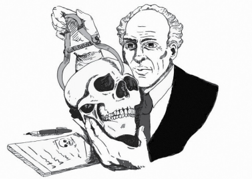
FIGURE 2.5. Karl Pearson with a skull from the Paris Catacombs. ( Source: Drawing by Dakota Harr.)
This example is a case of a more general phenomenon called Simpson's paradox. Chapter 6 will discuss when it is appropriate to segregate data into separate groups and will explain why spurious correlations can emerge from aggregation. But let's take a look at what Pearson wrote: 'To those who persist in looking upon all correlations as cause and effect, the fact that correlation can be produced between two quite uncorrelated characters A and B by taking an artificial mixture of two closely allied races, must come rather as a shock.' As Stephen Stigler comments, 'I cannot resist the speculation that he himself was the first one shocked.' In essence, Pearson was scolding himself for the tendency to think causally.
Looking at the same example through the lens of causality, we can only say, What a missed opportunity! In an ideal world, such examples might have spurred a talented scientist to think about the reason for his shock and develop a science to predict when spurious correlations appear. At the very least, he should explain when to aggregate the data and when not to. But Pearson's only guidance to his followers is that an 'artificial' mixture (whatever that means) is bad. Ironically, using our causal lens, we now know that in some cases the aggregated data, not the partitioned data, give the correct result. The logic of causal inference can actually tell us which one to trust. I wish that Pearson were here to enjoy it!
Pearson's students did not all follow in lockstep behind him. Yule, who broke with Pearson for other reasons, broke with him over this too. Initially he was in the hard-line camp holding that correlations say everything we could ever wish to understand about science. However, he changed his mind to some extent when he needed to explain poverty conditions in London. In 1899, he studied the question of whether 'out-relief' (that is, welfare delivered to a pauper's home versus a poorhouse) increased the rate of poverty. The data showed that districts with more out-relief had a higher poverty rate, but Yule realized that the correlation was possibly spurious: these districts might also have more elderly people, who tend to be poorer. However, he then showed that even in comparisons of districts with equal proportions of elderly people, the correlation remained. This emboldened him to say that the increased poverty rate was due to out-relief. But after stepping out of line to make this assertion, he fell back into line again, writing in a footnote, 'Strictly speaking, for 'due to' read 'associated with.'' This set the pattern for generations of scientists after him. They would think 'due to' and say 'associated with.'
With Pearson and his followers actively hostile toward causation, and with halfhearted dissidents such as Yule fearful of antagonizing their leader, the stage was set for another scientist from across the ocean to issue the first direct challenge to the causality-avoiding culture.
Sewall Wright, Guinea Pigs, and Path Diagrams
When Sewall Wright arrived at Harvard University in 1912, his academic background scarcely suggested the kind of lasting effect he would have on science. He had attended a small (and now defunct) college in Illinois, Lombard College, graduating in a class of only seven students. One of his teachers had been his own father, Philip Wright, an academic jack-of-all-trades who even ran the college's printing press. Sewall and his brother Quincy helped out with the press, and among other things they published the first poetry by a not-yet-famous Lombard student, Carl Sandburg.
Sewall Wright's ties with his father remained very close long after he graduated from college. Papa Philip moved to Massachusetts when Sewall did. Later, when Sewall worked in Washington, DC, Philip did likewise, first at the US Tariff Commission and then at the Brookings Institution as an economist. Although their academic interests diverged, they nevertheless found ways to collaborate, and Philip was the first economist to make use of his son's invention of path diagrams.
Wright came to Harvard to study genetics, at the time one of the hottest topics in science because Gregor Mendel's theory of dominant and recessive genes had just been rediscovered. Wright's advisor, William Castle, had identified eight different hereditary factors (or genes, as we would call them today) that affected fur color in rabbits. Castle assigned Wright to do the same thing for guinea pigs. After earning his doctorate in 1915, Wright got an offer for which he was uniquely qualified: taking care of guinea pigs at the US Department of Agriculture (USDA).
One wonders if the USDA knew what it was getting when it hired Wright. Perhaps it expected a diligent animal caretaker who could straighten out the chaos of twenty years of poorly kept records. Wright did all that and much, much more. Wright's guinea pigs were the springboard to his whole career and his whole theory of evolution, much like the finches on the Galapagos islands that had inspired Charles Darwin. Wright was an early advocate of the view that evolution is not gradual, as Darwin had posited, but takes place in relatively sudden bursts.
In 1925, Wright moved on to a faculty position at the University of Chicago that was probably better suited to someone with his wide-ranging theoretical interests. Even so, he remained very devoted to his guinea pigs. An often told anecdote says that he was once holding an unruly guinea pig under his arm while lecturing, and absentmindedly began using it to erase the blackboard (see Figure 2.6). While his biographers agree that this story is likely apocryphal, such stories often contain more truth than dry biographies do.
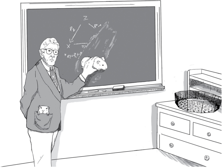
FIGURE 2.6. Sewall Wright was the first person to develop a mathematical method for answering causal questions from data, known as path diagrams. His love of mathematics surrendered only to his passion for guinea pigs. ( Source: Drawing by Dakota Harr.)
Wright's early work at the USDA interests us most here. The inheritance of coat color in guinea pigs stubbornly refused to play by Mendelian rules. It proved virtually impossible to breed an all-white or all-colored guinea pig, and even the most inbred families (after multiple generations of brother-sister mating) still had pronounced variation, from mostly white to mostly colored. This contradicted the prediction of Mendelian genetics that a particular trait should become 'fixed' by multiple generations of inbreeding.
Wright began to doubt that genetics alone governed the amount of white and postulated that 'developmental factors' in the womb were causing some of the variations. With hindsight, we know that he was correct. Different color genes are expressed in different places on the body, and the patterns of color depend not only on what genes the animal has inherited but where and in what combinations they happen to be expressed or suppressed.
As it often happens (at least to the ingenious!), a pressing research problem leads to new methods of analysis, which vastly transcended their origins in guinea pig genetics. Yet, for Sewall Wright, estimating the developmental factors probably seemed like a college-level problem that he could have solved in his father's math class at Lombard. When looking for the magnitude of some unknown quantity, you first assign a symbol to that quantity, next you express what you know about this and other quantities in the form of mathematical equations, and finally, if you have enough patience and enough equations, you can solve them and find your quantity of interest.
In Wright's case, the desired and unknown quantity (shown in Figure 2.7) was d, the effect of 'developmental factors' on white fur. Other causal quantities that entered into his equations included h, for 'hereditary' factors, also unknown. Finally—and here comes Wright's ingenuity—he showed that if we knew the causal quantities in Figure 2.7, we could predict correlations in the data (not shown in the diagram) by a simple graphical rule. This rule sets up a bridge from the deep, hidden world of causation to the surface world of correlations. It was the first bridge ever built between causality and probability, the first crossing of the barrier between rung two and rung one on the Ladder of Causation. Having built this bridge, Wright could travel backward over it, from the correlations measured in the data (rung one) to the hidden causal quantities, d and h (rung two). He did this by solving algebraic equations. This idea must have seemed simple to Wright but turned out to be revolutionary because it was the first proof that the mantra 'Correlation does not imply causation' should give way to 'Some correlations do imply causation.'
In the end, Wright showed that the hypothesized developmental factors were more important than heredity. In a randomly bred population of guinea pigs, 42 percent of the variation in coat pattern was due to heredity, and 58 percent was developmental. By contrast, in a highly inbred family, only 3 percent of the variation in white fur coverage was due to heredity, and 92 percent was developmental. In other words, twenty generations of inbreeding had all but eliminated the genetic variation, but the developmental factors remained.
As interesting as this result is, the crux of the matter for our history is the way that Wright made his case. The path diagram in Figure 2.7 is the street map that tells us how to navigate over this bridge between rung one and rung two. It is a scientific revolution in one picture—and it comes complete with adorable guinea pigs!
FIGURE 2.7. Sewall Wright's first path diagram, illustrating the factors leading to coat color in guinea pigs. D = developmental factors (after conception, before birth), E = environmental factors (after birth), G = genetic factors from each individual parent, H = combined hereditary factors from both parents, O O , ' = offspring. The objective of analysis was to estimate the strength of the effects of D E H , , (written as d , e , h in the diagram). ( Source: Sewall Wright, Proceedings of the National Academy of Sciences [1920], 320-332.)
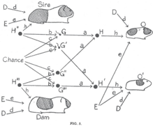
Notice that the path diagram shows every conceivable factor that could affect a baby guinea pig's pigmentation. The letters D, E, and H refer to developmental, environmental, and hereditary factors, respectively. Each parent (the sire and the dam) and each child (offspring O and O') has its own set of D, E, and H factors. The two offspring share environmental factors but have different developmental histories. The diagram incorporates the then novel insights of Mendelian genetics: a child's heredity (H) is determined by its parents' sperm and egg cells (G and G"), and these in turn are determined from the parents' heredity (H" and H‴) via a mixing process that was not yet understood (because DNA had not been discovered). It was understood, though, that the mixing process included an element of randomness (labeled 'Chance' in the diagram).
One thing the diagram does not show explicitly is the difference between an inbred family and a normal family. In an inbred family there would be a strong correlation between the heredity of the sire and the dam, which Wright indicated with a two-headed arrow between H" and H‴. Aside from that, every arrow in the diagram is one-way and leads from a cause to an effect. For example, the arrow from G to H indicates that the sire's sperm cell may have a direct causal effect on the offspring's heredity. The absence of an arrow from G to H' indicates that the sperm cell that gave rise to offspring O has no causal effect on the heredity of offspring O'.
When you take apart the diagram arrow by arrow in this way, I think you will find that every one of them makes perfect sense. Note also that each arrow is accompanied by a small letter (a, b, c, etc.). These letters, called path coefficients, represent the strength of the causal effects that Wright wanted to solve for. Roughly speaking, a path coefficient represents the amount of variability in the target variable that is accounted for by the source variable. For instance, it is fairly evident that 50 percent of each child's hereditary makeup should come from each parent, so that a should be 1/2. (For technical reasons, Wright preferred to take the square root, so that a = 1/√2 and a² = 1/2.)
This interpretation of path coefficients, in terms of the amount of variation explained by a variable, was reasonable at the time. The modern causal interpretation is different: the path coefficients represent the results of a hypothetical intervention on the source variable. However, the notion of an intervention would have to wait until the 1940s, and Wright could not have anticipated it when he wrote his paper in 1920. Fortunately, in the simple models he analyzed then, the two interpretations yield the same result.
I want to emphasize that the path diagram is not just a pretty picture; it is a powerful computational device because the rule for computing correlations (the bridge from rung two to rung one) involves tracing the paths that connect two variables to each other and multiplying the coefficients encountered along the way. Also, notice that the omitted arrows actually convey more significant assumptions than those that are present. An omitted arrow restricts the causal effect to zero, while a present arrow remains totally agnostic about the magnitude of the effect (unless we a priori impose some value on the path coefficient).
Wright's paper was a tour de force and deserves to be considered one of the landmark results of twentieth-century biology. Certainly it is a landmark for the history of causality. Figure 2.7 is the first causal diagram ever published, the first step of twentieth-century science onto the second rung of the Ladder of Causation. And not a tentative step but a bold and decisive one! The following year Wright published a much more general paper called 'Correlation and Causation' that explained how path analysis worked in other settings than guinea pig breeding.
I don't know what kind of reaction the thirty-year-old scientist expected, but the reaction he got surely must have stunned him. It came in the form of a rebuttal published in 1921 by one Henry Niles, a student of American statistician Raymond Pearl (no relation), who in turn was a student of Karl Pearson, the godfather of statistics.
Academia is full of genteel savagery, which I have had the honor to weather at times in my own otherwise placid career, but even so I have seldom seen a criticism as savage as Niles's. He begins with a long series of quotes from his heroes, Karl Pearson and Francis Galton, attesting to the redundancy or even meaninglessness of the word 'cause.' He concludes, 'To contrast 'causation' and 'correlation' is unwarranted because causation is simply perfect correlation.' In this sentence he is directly echoing what Pearson wrote in Grammar of Science.
Niles further disparages Wright's entire methodology. He writes, 'The basic fallacy of the method appears to be the assumption that it is possible to set up a priori a comparatively simple graphic system which will truly represent the lines of action of several variables upon each other, and upon a common result.' Finally, Niles works through some examples and, bungling the computations because he has not taken the trouble to understand Wright's rules, he arrives at opposite conclusions. In summary, he declares, 'We therefore conclude that philosophically the basis of the method of path coefficients is faulty, while practically the results of applying it where it can be checked prove it to be wholly unreliable.'
From the scientific point of view a detailed discussion of Niles's criticism is perhaps not worth the time, but his paper is very important to us as historians of causation. First, it faithfully reflects the attitude of his generation toward causation and the total grip that his mentor, Karl Pearson, had on the scientific thinking of his time. Second, we continue to hear Niles's objections today.
Of course, at times scientists do not know the entire web of relationships between their variables. In that case, Wright argued, we can use the diagram in exploratory mode; we can postulate certain causal relationships and work out the predicted correlations between variables. If these contradict the data, then we have evidence that the relationships we assumed were false. This way of using path diagrams, rediscovered in 1953 by Herbert Simon (a 1978 Nobel laureate in economics), inspired much work in the social sciences.
Although we don't need to know every causal relation between the variables of interest and might be able to draw some conclusions with only partial information, Wright makes one point with absolute clarity: you cannot draw causal conclusions without some causal hypotheses. This echoes what we concluded in Chapter 1: you cannot answer a question on rung two of the Ladder of Causation using only data collected from rung one.
Sometimes people ask me, 'Doesn't that make causal reasoning circular? Aren't you just assuming what you want to prove?' The answer is no. By combining very mild, qualitative, and obvious assumptions (e.g., coat color of the son does not influence that of the parents) with his twenty years of guinea pig data, he obtained a quantitative and by no means obvious result: that 42 percent of the variation in coat color is due to heredity. Extracting the nonobvious from the obvious is not circular—it is a scientific triumph and deserves to be hailed as such.
Wright's contribution is unique because the information leading to the conclusion (of 42 percent heritability) resided in two distinct, almost incompatible mathematical languages: the language of diagrams on one side and that of data on the other. This heretical idea of marrying qualitative 'arrow-information' to quantitative 'data-information' (two foreign languages!) was one of the miracles that first attracted me, as a computer scientist, to this enterprise.
Many people still make Niles's mistake of thinking that the goal of causal analysis is to prove that X is a cause of Y or else to find the cause of Y from scratch. That is the problem of causal discovery, which was my ambitious dream when I first plunged into graphical modeling and is still an area of vigorous research. In contrast, the focus of Wright's research, as well as this book, is representing plausible causal knowledge in some mathematical language, combining it with empirical data, and answering causal queries that are of practical value. Wright understood from the very beginning that causal discovery was much more difficult and perhaps impossible. In his response to Niles, he writes, 'The writer [i.e., Wright himself] has never made the preposterous claim that the theory of path coefficients provides a general formula for the deduction of causal relations. He wishes to submit that the combination of knowledge of correlations with knowledge of causal relations to obtain certain results, is a different thing from the deduction of causal relations from correlations implied by Niles' statement.'
E Pur Si Muove (And Yet It Moves)
If I were a professional historian, I would probably stop here. But as the 'Whig historian' that I promised to be, I cannot contain myself from expressing my sheer admiration for the precision of Wright's words in the quote ending the previous section, which have not gone stale in the ninety years since he first articulated them and which essentially defined the new paradigm of modern causal analysis.
My admiration for Wright's precision is second only to my admiration for his courage and determination. Imagine the situation in 1921. A self-taught mathematician faces the hegemony of the statistical establishment alone. They tell him, 'Your method is based on a complete misapprehension of the nature of causality in the scientific sense.' And he retorts, 'Not so! My method generates something that is important and goes beyond anything that you can generate.' They say, 'Our gurus looked into these problems already, two decades ago, and concluded that what you have done is nonsense. You have only combined correlations with correlations and gotten correlations. When you grow up, you will understand.' And he continues, 'I am not dismissing your gurus, but a spade is a spade. My path coefficients are not correlations. They are something totally different: causal effects.'
Imagine that you are in kindergarten, and your friends mock you for believing that 3 + 4 = 7, when everybody knows that 3 + 4 = 8. Then imagine going to your teacher for help and hearing her say, too, that 3 + 4 = 8. Would you not go home and ask yourself if perhaps there was something wrong with the way you were thinking? Even the strongest man would start to waver in his convictions. I have been in that kindergarten, and I know.
But Wright did not blink. And this was not just a matter of arithmetic, where there can be some sort of independent verification. Only philosophers had dared to express an opinion on the nature of causation. Where did Wright get this inner conviction that he was on the right track and the rest of the kindergarten class was just plain wrong? Maybe his Midwestern upbringing and the tiny college he went to encouraged his self-reliance and taught him that the surest kind of knowledge is what you construct yourself.
One of the earliest science books I read in school told of how the Inquisition forced Galileo to recant his teaching that Earth revolves around the sun and how he whispered under his breath, 'And yet it moves' (E pur si muove). I don't think that there is a child in the world who has read this legend and not been inspired by Galileo's courage in defending his convictions. Yet as much as we admire him for his stand, I can't help but think that he at least had his astronomical observations to fall back on. Wright had only untested conclusions—say, that developmental factors account for 58 percent, not 3 percent, of variation. With nothing to lean on except his internal conviction that path coefficients tell you what correlations do not, he still declared, 'And yet it moves!'
Colleagues tell me that when Bayesian networks fought against the artificial intelligence establishment (see Chapter 3), I acted stubbornly, singlemindedly, and uncompromisingly. Indeed, I recall being totally convinced of my approach, with not an iota of hesitation. But I had probability theory on my side. Wright didn't have even one theorem to lean on. Scientists had abandoned causation, so Wright could not fall back on any theoretical framework. Nor could he rely on authorities, as Niles did, because there was no one for him to quote; the gurus had already pronounced their verdicts three decades earlier.
But one solace to Wright, and one sign that he was on the right path, must have been his understanding that he could answer questions that cannot be answered in any other way. Determining the relative importance of several factors was one such question. Another beautiful example of this can be found in his 'Correlation and Causation' paper, from 1921, which asks how much a guinea pig's birth weight will be affected if it spends one more day in the womb. I would like to examine Wright's answer in some detail to enjoy the beauty of his method and to satisfy readers who would like to see how the mathematics of path analysis works.
Notice that we cannot answer Wright's question directly, because we can't weigh a guinea pig in the womb. What we can do, though, is compare the birth weights of guinea pigs that spend (say) sixty-six days gestating with those that spend sixty-seven days. Wright noted that the guinea pigs that spent a day longer in the womb weighed an average of 5.66 grams more at birth. So, one might naively suppose that a guinea pig embryo grows at 5.66 grams per day just before it is born.
'Wrong!' says Wright. The pups born later are usually born later for a reason: they have fewer litter mates. This means that they have had a more favorable environment for growth throughout the pregnancy. A pup with only two siblings, for instance, will already weigh more on day sixty-six than a pup with four siblings. Thus the difference in birth weights has two causes, and we want to disentangle them. How much of the 5.66 grams is due to spending an additional day in utero and how much is due to having fewer siblings to compete with?
Wright answered this question by setting up a path diagram (Figure 2.8). X represents the pup's birth weight. Q and P represent the two known causes of the birth weight: the length of gestation (P) and rate of growth in utero (Q). L represents litter size, which affects both P and Q (a larger litter causes the pup to grow slower and also have fewer days in utero). It's very important to realize that X, P, and L can be measured, for each guinea pig, but Q cannot. Finally, A and C are exogenous causes that we don't have any data about (e.g., hereditary and environmental factors that control growth rate and gestation time independently of litter size). The important assumption that these factors are independent of each other is conveyed by the absence of any arrow between them, as well as of any common ancestor.
FIGURE 2.8. Causal (path) diagram for birth-weight example.
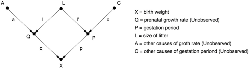
Now the question facing Wright was, 'What is the direct effect of the gestation period P on the birth weight X?' The data (5.66 grams per day) don't tell you the direct effect; they give you a correlation, biased by the litter size L. To get the direct effect, we need to remove this bias.
In Figure 2.8, the direct effect is represented by the path coefficient p, corresponding to the path P → X. The bias due to litter size corresponds to the path P → L → Q → X. And now the algebraic magic: the amount of bias is equal to the product of the path coefficients along that path (in other words, l times l' times q). The total correlation, then, is just the sum of the path coefficients along the two paths: algebraically, p + (l × l' × q) = 5.66 grams per day.
If we knew the path coefficients l, l', and q, then we could just work out the second term and subtract it from 5.66 to get the desired quantity p. But we don't know them, because Q (for example) is not measured. But here's where the ingenuity of path coefficients really shines. Wright's methods tell us how to express each of the measured correlations in terms of the path coefficients. After doing this for each of the measured pairs (P, X), (L, X), and (L, P), we obtain three equations that can be solved algebraically for the unknown path coefficients, p, l', and l × q. Then we are done, because the desired quantity p has been obtained.
Today we can skip the mathematics altogether and calculate p by cursory inspection of the diagram. But in 1920, this was the first time that mathematics was summoned to connect causation and correlation. And it worked! Wright calculated p to be 3.34 grams per day. In other words, had all the other variables (A, L, C, Q) been held constant and only the time of gestation increased by a day, the average increase in birth weight would be 3.34 grams per day. Note that this result is biologically meaningful. It tells us how rapidly the pups are growing per day before birth. By contrast, the number 5.66 grams per day has no biological significance, because it conflates two separate processes, one of which is not causal but anticausal (or diagnostic) in the link P → L. Lesson one from this example: causal analysis allows us to quantify processes in the real world, not just patterns in the data. The pups are growing at 3.34 grams per day, not 5.66 grams per day. Lesson two, whether you followed the mathematics or not: in path analysis you draw conclusions about individual causal relationships by examining the diagram as a whole. The entire structure of the diagram may be needed to estimate each individual parameter.
In a world where science progresses logically, Wright's response to Niles should have produced a scientific excitement followed by an enthusiastic adoption of his methods by other scientists and statisticians. But that is not what happened. 'One of the mysteries of the history of science from 1920 to 1960 is the virtual absence of any appreciable use of path analysis, except by Wright himself and by students of animal breeding,' wrote one of Wright's geneticist colleagues, James Crow. 'Although Wright had illustrated many diverse problems to which the method was applicable, none of these leads was followed.'
Crow didn't know it, but the mystery extended to social sciences as well. In 1972, economist Arthur Goldberger lamented the 'scandalous neglect' of Wright's work during that period and noted, with the enthusiasm of a convert, that '[Wright's] approach… sparked the recent upsurge of causal modeling in sociology.'
If only we could go back and ask Wright's contemporaries, 'Why didn't you pay attention?' Crow suggests one reason: path analysis 'doesn't lend itself to 'canned' programs. The user has to have a hypothesis and must devise an appropriate diagram of multiple causal sequences.' Indeed, Crow put his finger on an essential point: path analysis requires scientific thinking, as does every exercise in causal inference. Statistics, as frequently practiced, discourages it and encourages 'canned' procedures instead. Scientists will always prefer routine calculations on data to methods that challenge their scientific knowledge.
R. A. Fisher, the undisputed high priest of statistics in the generation after Galton and Pearson, described this difference succinctly. In 1925, he wrote, 'Statistics may be regarded as… the study of methods of the reduction of data.' Pay attention to the words 'methods,' 'reduction,' and 'data.' Wright abhorred the idea of statistics as merely a collection of methods; Fisher embraced it. Causal analysis is emphatically not just about data; in causal analysis we must incorporate some understanding of the process that produces the data, and then we get something that was not in the data to begin with. But Fisher was right about one point: once you remove causation from statistics, reduction of data is the only thing left.
Although Crow did not mention it, Wright's biographer William Provine points out another factor that may have affected the lack of support for path analysis. From the mid-1930s onward, Fisher considered Wright his enemy. I previously quoted Yule on how relations with Pearson became strained if you disagreed with him and impossible if you criticized him. Exactly the same thing could be said about Fisher. The latter carried out nasty feuds with anyone he disagreed with, including Pearson, Pearson's son Egon, Jerzy Neyman (more will be said on these two in Chapter 8), and of course Wright.
The real focus of the Fisher-Wright rivalry was not path analysis but evolutionary biology. Fisher disagreed with Wright's theory (called 'genetic drift') that a species can evolve rapidly when it undergoes a population bottleneck. The details of the dispute are beyond the scope of this book, and the interested reader should consult Provine. Relevant here is this: from the 1920s to the 1950s, the scientific world for the most part turned to Fisher as its oracle for statistical knowledge. And you can be certain that Fisher never said one kind word to anyone about path analysis.
In the 1960s, things began to change. A group of social scientists, including Otis Duncan, Hubert Blalock, and the economist Arthur Goldberger (mentioned earlier), rediscovered path analysis as a method of predicting the effect of social and educational policies. In yet another irony of history, Wright had actually been asked to speak to an influential group of econometricians called the Cowles Commission in 1947, but he utterly failed to communicate to them what path diagrams were about. Only when economists arrived at similar ideas themselves was a short-lived connection forged.
The fates of path analysis in economics and sociology followed different trajectories, each leading to a betrayal of Wright's ideas. Sociologists renamed path analysis as structural equation modeling (SEM), embraced diagrams, and used them extensively until 1970, when a computer package called LISREL automated the calculation of path coefficients (in some cases). Wright would have predicted what followed: path analysis turned into a rote method, and researchers became software users with little interest in what was going on under the hood. In the late 1980s, a public challenge (by statistician David Freedman) to explain the assumptions behind SEM went unanswered, and some leading SEM experts even disavowed that SEMs had anything to do with causality.
In economics, the algebraic part of path analysis became known as simultaneous equation models (no acronym). Economists essentially never used path diagrams and continue not to use them to this day, relying instead on numerical equations and matrix algebra. A dire consequence of this is that, because algebraic equations are nondirectional (that is, x = y is the same as y = x), economists had no notational means to distinguish causal from regression equations and thus were unable to answer policy-related questions, even after solving the equations. As late as 1995, most economists refrained from explicitly attributing causal or counterfactual meaning to their equations. Even those who used structural equations for policy decisions remained incurably suspicious of diagrams, which could have saved them pages and pages of computation. Not surprisingly, some economists continue to claim that 'it's all in the data' to this very day.
For all these reasons, the promise of path diagrams remained only partially realized, at best, until the 1990s. In 1983, Wright himself was called back into the ring one more time to defend them, this time in the American Journal of Human Genetics. At the time he wrote this article, Wright was past ninety years old. It is both wonderful and tragic to read his essay, written in 1983, on the very same topic he had written about in 1923. How many times in the history of science have we had the privilege of hearing from a theory's creator sixty years after he first set it down on paper? It would be like Charles Darwin coming back from the grave to testify at the Scopes Monkey Trial in 1925. But it is also tragic, because in the intervening sixty years his theory should have developed, grown, and flourished; instead it had advanced little since the 1920s.
The motivation for Wright's paper was a critique of path analysis, published in the same journal, by Samuel Karlin (a Stanford mathematician and recipient of the 1989 National Medal of Science, who made fundamental contributions to economics and population genetics) and two coauthors. Of interest to us are two of Karlin's arguments.
First, Karlin objects to path analysis for a reason that Niles did not raise: it assumes that all the relationships between any two variables in the path diagram are linear. This assumption allows Wright to describe the causal relationships with a single number, the path coefficient. If the equations were not linear, then the effect on Y of a one-unit change in X might depend on the current value of X. Neither Karlin nor Wright realized that a general nonlinear theory was just around the corner. (It would be developed three years later by a star student in my lab, Thomas Verma.)
But Karlin's most interesting criticism was also the one that he considered the most important: 'Finally, and we think most fruitfully, one can adopt an essentially model-free approach, seeking to understand the data interactively by using a battery of displays, indices, and contrasts. This approach emphasizes the concept of robustness in interpreting results.' In this one sentence Karlin articulates how little had changed from the days of Pearson and how much influence Pearson's ideology still had in 1983. He is saying that the data themselves already contain all scientific wisdom; they need only be cajoled and massaged (by 'displays, indices, and contrasts') into dispensing those pearls of wisdom. There is no need for our analysis to take into account the process that generated the data. We would do just as well, if not better, with a 'model-free approach.' If Pearson were alive today, living in the era of Big Data, he would say exactly this: the answers are all in the data.
Of course, Karlin's statement violates everything we learned in Chapter 1. To speak of causality, we must have a mental model of the real world. A 'model-free approach' may take us to the first rung of the Ladder of Causation, but no farther.
Wright, to his great credit, understood the enormous stakes and stated in no uncertain terms, 'In treating the model-free approach (3) as preferred alternative… Karlin et al. are urging not merely a change in method, but an abandonment of the purpose of path analysis and evaluation of the relative importance of varying causes. There can be no such analysis without a model. Their advice to anyone with an urge to make such an evaluation is to repress it and do something else.'
Wright understood that he was defending the very essence of the scientific method and the interpretation of data. I would give the same advice today to big-data, model-free enthusiasts. Of course, it is okay to tease out all the information that the data can provide, but let's ask how far this will get us. It will never get us beyond the first rung of the Ladder of Causation, and it will never answer even as simple a question as 'What is the relative importance of various causes?' E pur si muove!
From Objectivity to Subjectivity—The Bayesian Connection
One other theme in Wright's rebuttal may hint at another reason for the resistance of statisticians to causality. He repeatedly states that he did not want path analysis to become 'stereotyped.' According to Wright, 'The unstereotyped approach of path analysis differs profoundly from the stereotyped modes of description designed to avoid any departures from complete objectivity.'
What does he mean? First, he means that path analysis should be based on the user's personal understanding of causal processes, reflected in the causal diagram. It cannot be reduced to mechanical routines, such as those laid out in statistics manuals. For Wright, drawing a path diagram is not a statistical exercise; it is an exercise in genetics, economics, psychology, or whatever the scientist's own field of expertise is.
Second, Wright traces the allure of 'model-free' methods to their objectivity. This has indeed been a holy grail for statisticians since day one—or since March 15, 1834, when the Statistical Society of London was founded. Its founding charter said that data were to receive priority in all cases over opinions and interpretations. Data are objective; opinions are subjective. This paradigm long predates Pearson. The struggle for objectivity—the idea of reasoning exclusively from data and experiment—has been part of the way that science has defined itself ever since Galileo.
Unlike correlation and most of the other tools of mainstream statistics, causal analysis requires the user to make a subjective commitment. She must draw a causal diagram that reflects her qualitative belief—or, better yet, the consensus belief of researchers in her field of expertise—about the topology of the causal processes at work. She must abandon the centuries-old dogma of objectivity for objectivity's sake. Where causation is concerned, a grain of wise subjectivity tells us more about the real world than any amount of objectivity.
In the above paragraph, I said that 'most of' the tools of statistics strive for complete objectivity. There is one important exception to this rule, though. A branch of statistics called Bayesian statistics has achieved growing popularity over the last fifty years or so. Once considered almost anathema, it has now gone completely mainstream, and you can attend an entire statistics conference without hearing any of the great debates between 'Bayesians' and 'frequentists' that used to thunder in the 1960s and 1970s.
The prototype of Bayesian analysis goes like this: Prior Belief + New Evidence → Revised Belief. For instance, suppose you toss a coin ten times and find that in nine of those tosses the coin came up heads. Your belief that the coin is fair is probably shaken, but how much? An orthodox statistician would say, 'In the absence of any additional evidence, I would believe that this coin is loaded, so I would bet nine to one that the next toss turns up heads.'
A Bayesian statistician, on the other hand, would say, 'Wait a minute. We also need to take into account our prior knowledge about the coin.' Did it come from the neighborhood grocery or a shady gambler? If it's just an ordinary quarter, most of us would not let the coincidence of nine heads sway our belief so dramatically. On the other hand, if we already suspected the coin was weighted, we would conclude more willingly that the nine heads provided serious evidence of bias.
Bayesian statistics give us an objective way of combining the observed evidence with our prior knowledge (or subjective belief) to obtain a revised belief and hence a revised prediction of the outcome of the coin's next toss. Still, what frequentists could not abide was that Bayesians were allowing opinion, in the form of subjective probabilities, to intrude into the pristine kingdom of statistics. Mainstream statisticians were won over only grudgingly, when Bayesian analysis proved a superior tool for a variety of applications, such as weather prediction and tracking enemy submarines. In addition, in many cases it can be proven that the influence of prior beliefs vanishes as the size of the data increases, leaving a single objective conclusion in the end.
Unfortunately, the acceptance of Bayesian subjectivity in mainstream statistics did nothing to help the acceptance of causal subjectivity, the kind needed to specify a path diagram. Why? The answer rests on a grand linguistic barrier. To articulate subjective assumptions, Bayesian statisticians still use the language of probability, the native language of Galton and Pearson. The assumptions entering causal inference, on the other hand, require a richer language (e.g., diagrams) that is foreign to Bayesians and frequentists alike. The reconciliation between Bayesians and frequentists shows that philosophical barriers can be bridged with goodwill and a common language. Linguistic barriers are not surmounted so easily.
Moreover, the subjective component in causal information does not necessarily diminish over time, even as the amount of data increases. Two people who believe in two different causal diagrams can analyze the same data and may never come to the same conclusion, regardless of how 'big' the data are. This is a terrifying prospect for advocates of scientific objectivity, which explains their refusal to accept the inevitability of relying on subjective causal information.
On the positive side, causal inference is objective in one critically important sense: once two people agree on their assumptions, it provides a 100 percent objective way of interpreting any new evidence (or data). It shares this property with Bayesian inference. So the savvy reader will probably not be surprised to find out that I arrived at the theory of causality through a circuitous route that started with Bayesian probability and then took a huge detour through Bayesian networks. I will tell that story in the next chapter.